The cosmetics industry is a multi-billion dollar powerhouse, often driven by dynamic trends and elaborate marketing campaigns. But while many retailers have gravitated towards this strategy to boost their visibility, Aesop proves that there are other paths to building a successful brand — one that isn’t reliant on endorsements and online algorithms.
For 33 years, Aesop’s approach to skincare has been fabled — their signature medicinal packaging and monochrome labels easily recognizable on almost any shelf. Founded on timeless simplicity, the company manages to cut through the noise with their distinct visual identity. Using word of mouth as their main avenue for promotion, it’s their stores that end up doing most of the talking. Whether in Tokyo or London, each location is a physical manifestation of the Aesop philosophy.
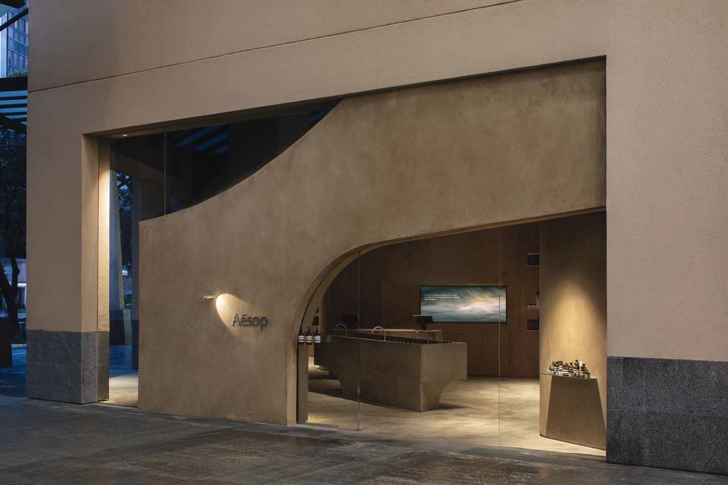
Their first and only store in Manila is no different. From afar, the shop doesn’t seek to command your attention. Unlike other popular skincare stores, you won’t find any flashy neon signs or “Instagram” walls here. Instead, its bare concrete pillars blend into the background seamlessly — almost as if it were a natural part of the urban landscape. True enough, this is exactly what the team behind the luxury retailer hopes to achieve. As Retail Architectural Manager Denise Neri would later reveal to PURVEYR, each store aims “to add rather than subtract.”
Since opening their doors early last year, Aesop Manila has managed to generate a significant amount of buzz among customers both new and old. Prior to this, consumers who wanted to take home their own amber glass bottles would have to visit neighboring cities like Hong Kong. However, anyone who has been following the brand knows to expect that no two stores are ever the same — making this branch well worth the experience, regardless of how many Aesop stores around the world you’ve visited.
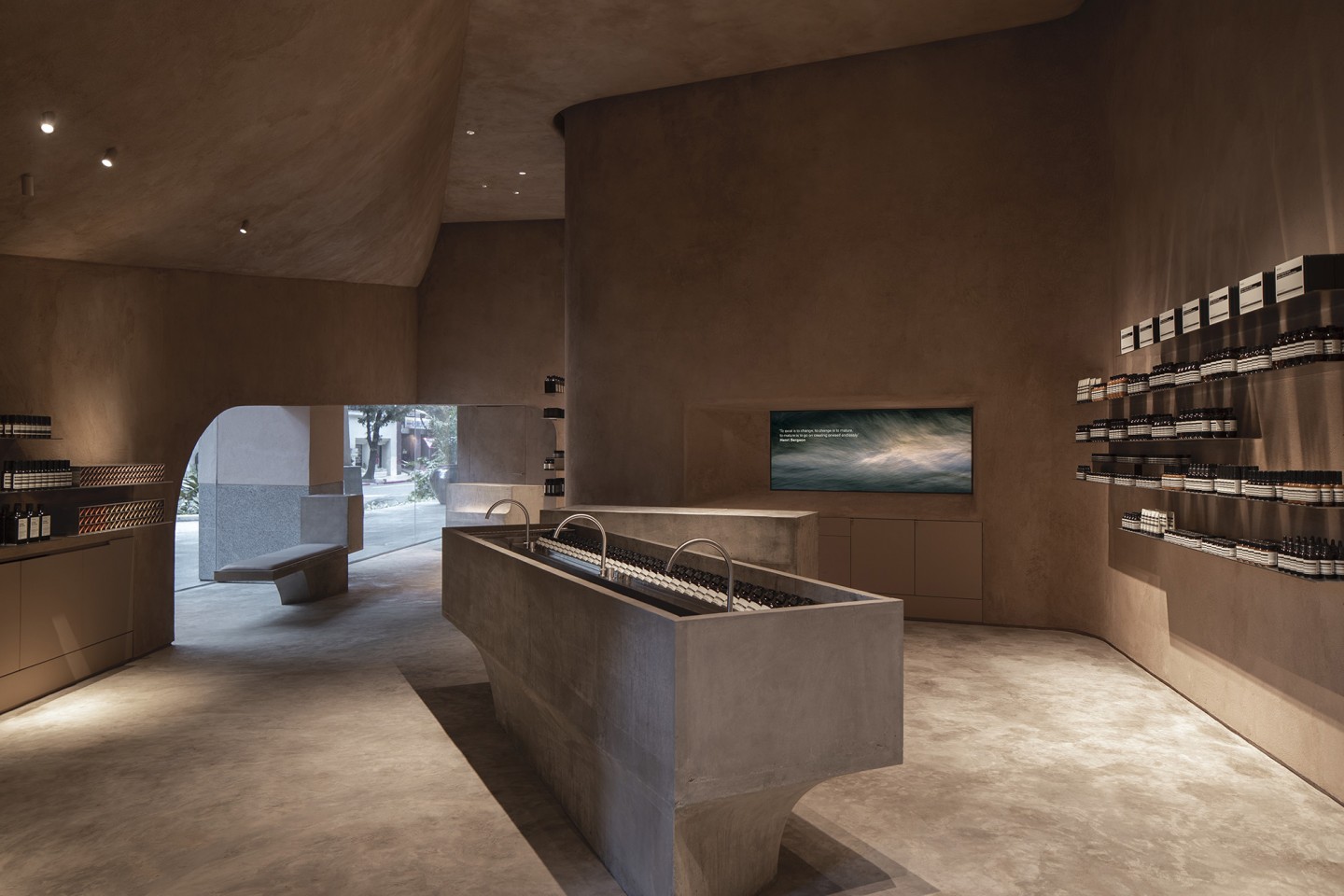
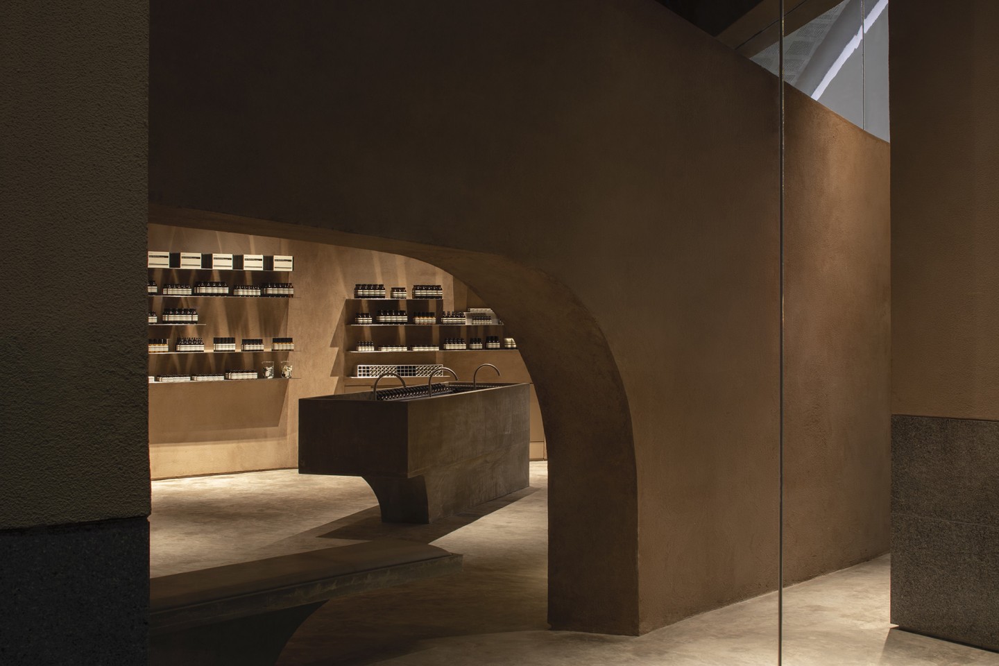
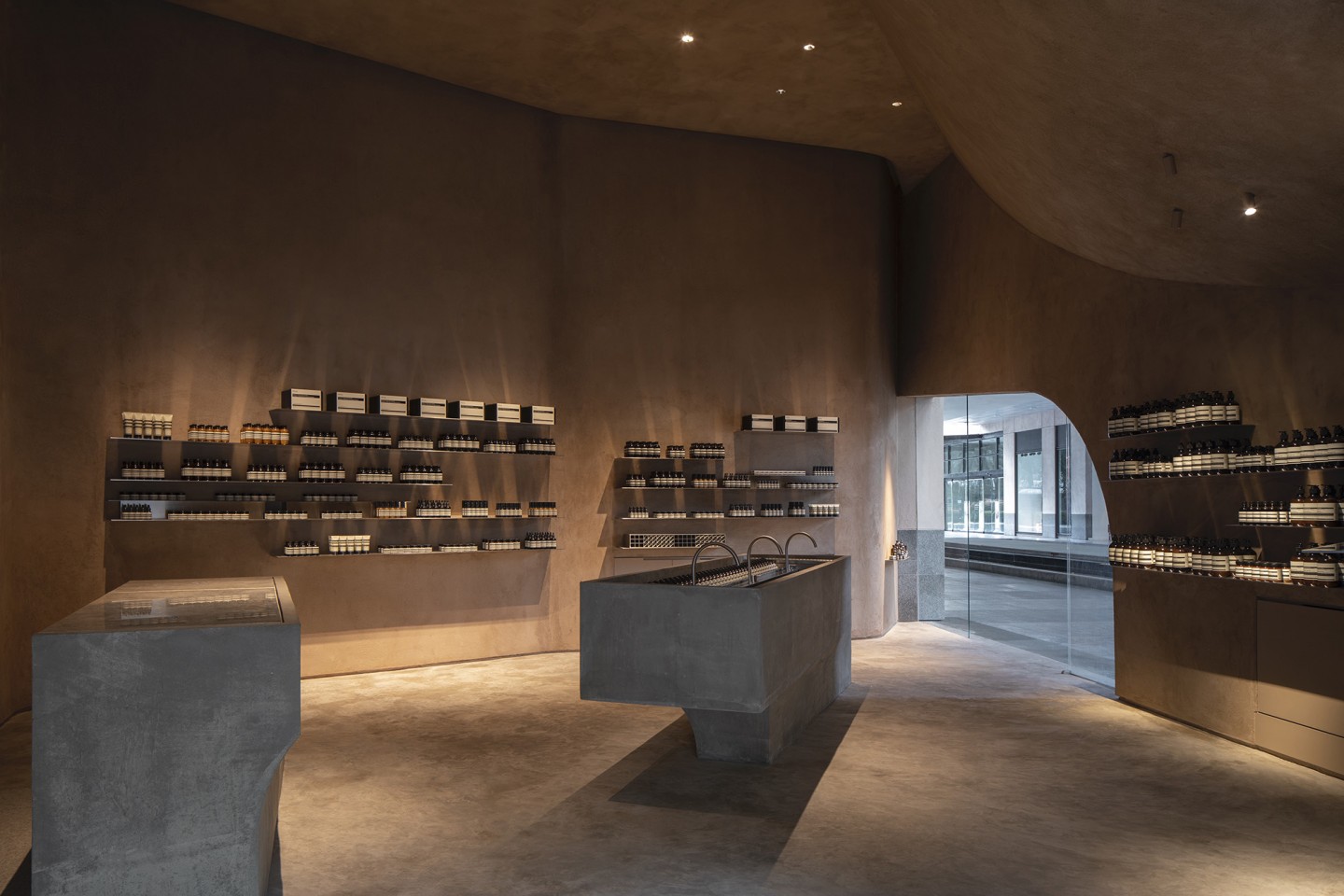
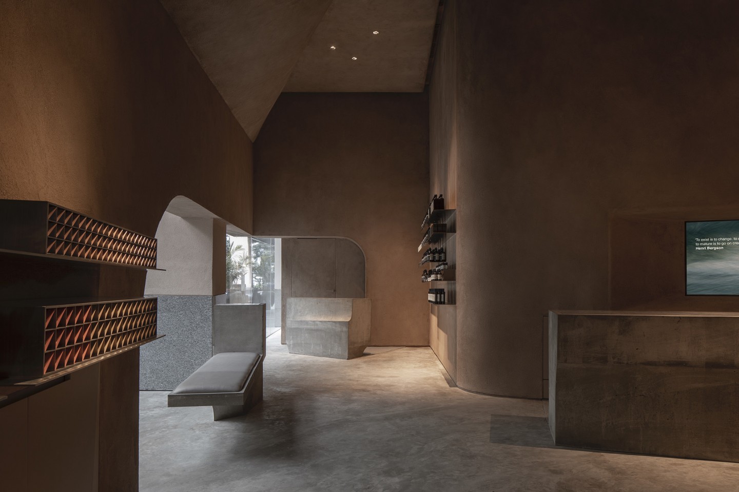
Located inside Greenbelt 5, the store pays tribute to the site’s architectural history as the old Ayala Museum. First designed by Filipino architect Leandro Locsin in the 1960’s, the famed museum takes cues from Brutalist elements like modular angles and an overall utilitarian feel. Despite their bare-bones method, there is nothing empty about the retail experience they bring. From the concaving ceiling to the ruminative Henri Bergson quote on the wall, each feature is thoughtfully put together to express the brand’s ethos.
Having been at the helm of Aesop’s global architectural program since 2013, Neri has played a vital role in establishing the store’s presence across the globe. In an exclusive interview with PURVEYR, she discusses Aesop’s direction in the current retail environment, and the fundamental role of design in building a brand that sticks.
How do you define the Aesop retail experience? What is the reason behind the immense energy and effort put into this channel?
Our stores and counters are a clear communication of our values and our approach to retail service. We think of it as a hosting experience. The store is a welcoming, calm space where you are treated as a guest in our home — with high quality products, unobtrusive service, and a comfortable space that appeals to all the senses.
Two Aesop spaces are never the same, but when a customer enters any door around the world, they encounter familiar features: the products on our shelves, expert knowledge, gracious hospitality and service extended by our consultants, and an aesthetic anchored not only to our sensibility but to local culture, traditions and materials.
Our exacting standards demand that we remain fully responsible for every aspect of the business—be it the concepts and formulation of our products, or the settings in which they are presented and ways in which their benefits are articulated and demonstrated. If we were to stray from these standards, our offer would inevitably be diminished.
Can you share a bit about Aesop’s history as a brand and retail concept? From the start, have you always had the same vision that relies on minimalism and simplicity? This is reflected in your stores, customer experience, and even your packaging. Would you say it has evolved throughout the years?
Aesop was established with the aim of doing things better. In 1987, very few companies were using botanical ingredients. However, our founder Dennis Paphitis believed essential oils would deliver remarkable nourishment to the hair, able to replace synthetic additives and strong aromas in traditional hair care products. He initially pioneered their use in formulations to treat color-damaged hair—and from this work grew a modest hair and body care range. By 1991, we were ready to start developing exceptional skincare products.
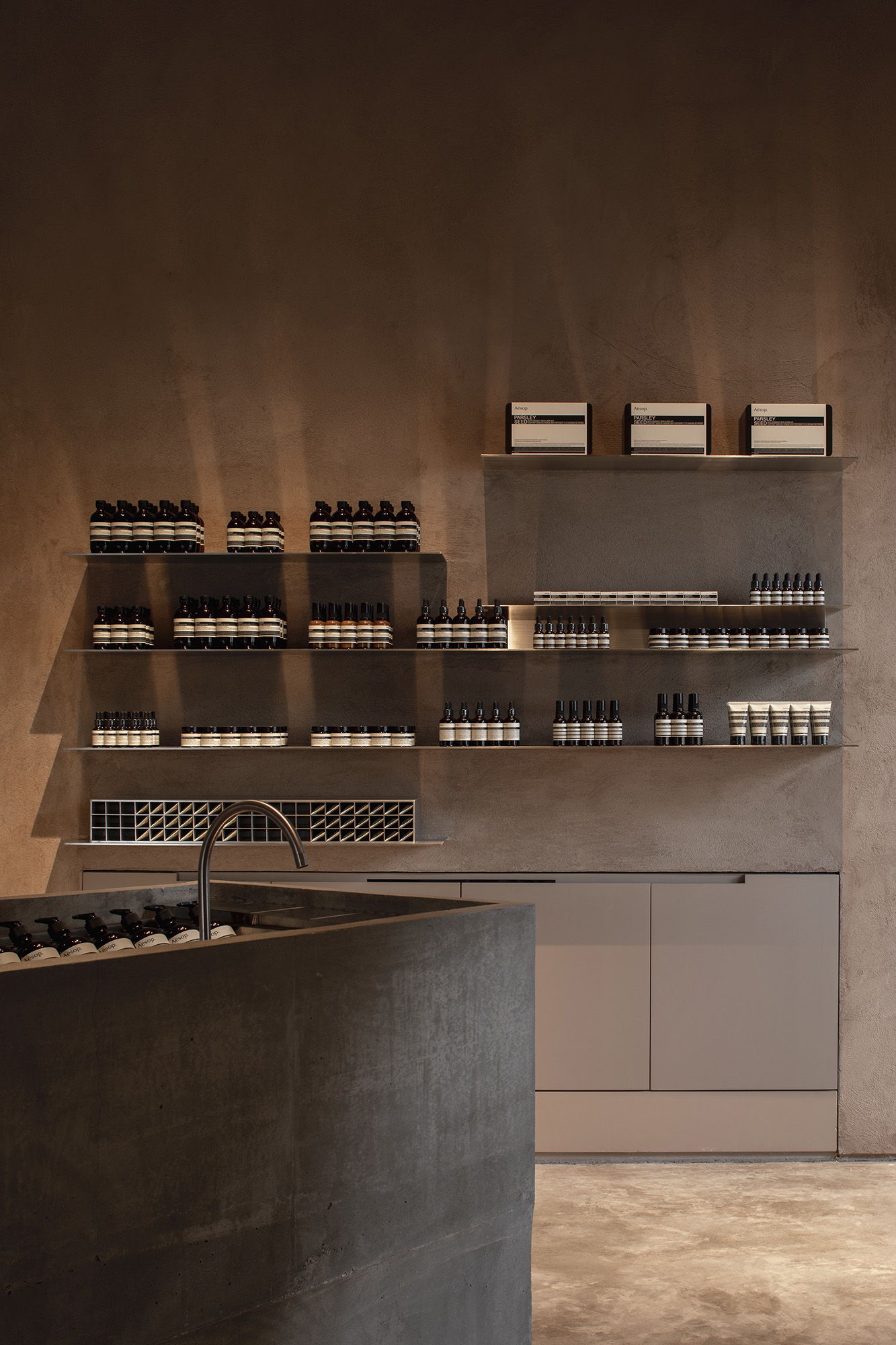
Throughout Aesop’s evolution, we have followed a fiercely independent approach to skin care — always aiming to deliver products of maximum benefit and sensory pleasure through solid science, uncomplicated packaging, and a light sense of humor. Simplicity, doing more with less, and authenticity remain at the heart of what we do. We have also maintained a commitment to service of the highest caliber for our customers as their needs have broadened and evolved.
We believe that good design improves lives, and we follow this ethos in every aspect of the company, whether through retail design or product packaging.
Around the world, Aesop stores are known for their unique and localized designs that are specific to each of their locations. What, for you, is the importance of design when it comes to retail stores, especially in contrast to e-commerce and brands choosing to forgo brick-and-mortar altogether?
Skincare is a physical experience. People want to smell, touch, and feel the products when they are trying something new. When leisure-shopping in a physical store, they may also look for stimulation, an element of theatre, and pleasurable social interaction so a design that is intriguing or charming adds an extra dimension of attraction. But it’s the whole experience and balance of nuanced elements that keep the customer with us. In fact, we consider the digital experience as an important part of the whole. Those services should mesh as seamlessly as possible to support our customers, whichever way they choose to shop with us.
While we’re on the topic of physical stores, there’s also an obvious shift driving these establishments to hone experiences instead of just sell products. This is something that Aesop has been doing ever since, but what led to this ideology of an elevated retail experience?
There was always a strong desire to explore ideas as widely as possible — to do things in the best, most interesting way. Aesop has been open to many diverse influences in its pursuit of excellence. For example, many in-store gestures (which are now part of the Aesop lexicon) came from our early days in Japan. There has always been a genuine desire to connect and become part of the area we enter. [Eventually], events with local writers, artists, and musicians often developed quite organically.
Of all the things to draw inspiration from in local Philippine design, why did you choose to take after the Ayala Museum in the 1960’s, besides the site’s architectural history? How does the store’s location play into the wider urban landscape?
The Ayala Museum was the direct link to the site’s history, but inspiration for the store was drawn more broadly from the essence of Fernando Locsin’s architectural legacy. The sweeping curves and nimble geometries of his immense buildings contrasted the ideas of floating forms and tethered gravity. His works defined an era of Filipino modernism and progress.
The store’s location at Greenbelt places it at the center of a vibrant younger growth area in Manila City.
As mentioned earlier, Brutalism also plays a huge role in the inspiration. When it comes to “local” design, however, most brands usually stick with tropical elements — such as palm trees, abaca, and bamboo. It’s refreshing to see a space veer away from that. Why go with this specific style?
The ideas behind this style are interesting and have meaning. Locsin was influenced by traditional Filipino culture. As an example, his famous “Floating Effect” buildings were a translation of traditional practices into modern forms. His work was ground-breaking and sophisticated, being neo-vernacular rather than folkloric. We thought his originality and legacy deserved an affectionate homage in our first project in Manila.
Material consideration and craftsmanship are other factors that you take into consideration in designing your stores. Can you tell us about how you selected the specific elements in the Manila branch?
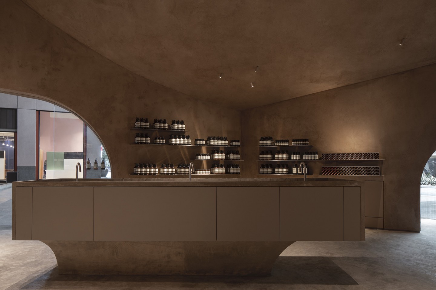
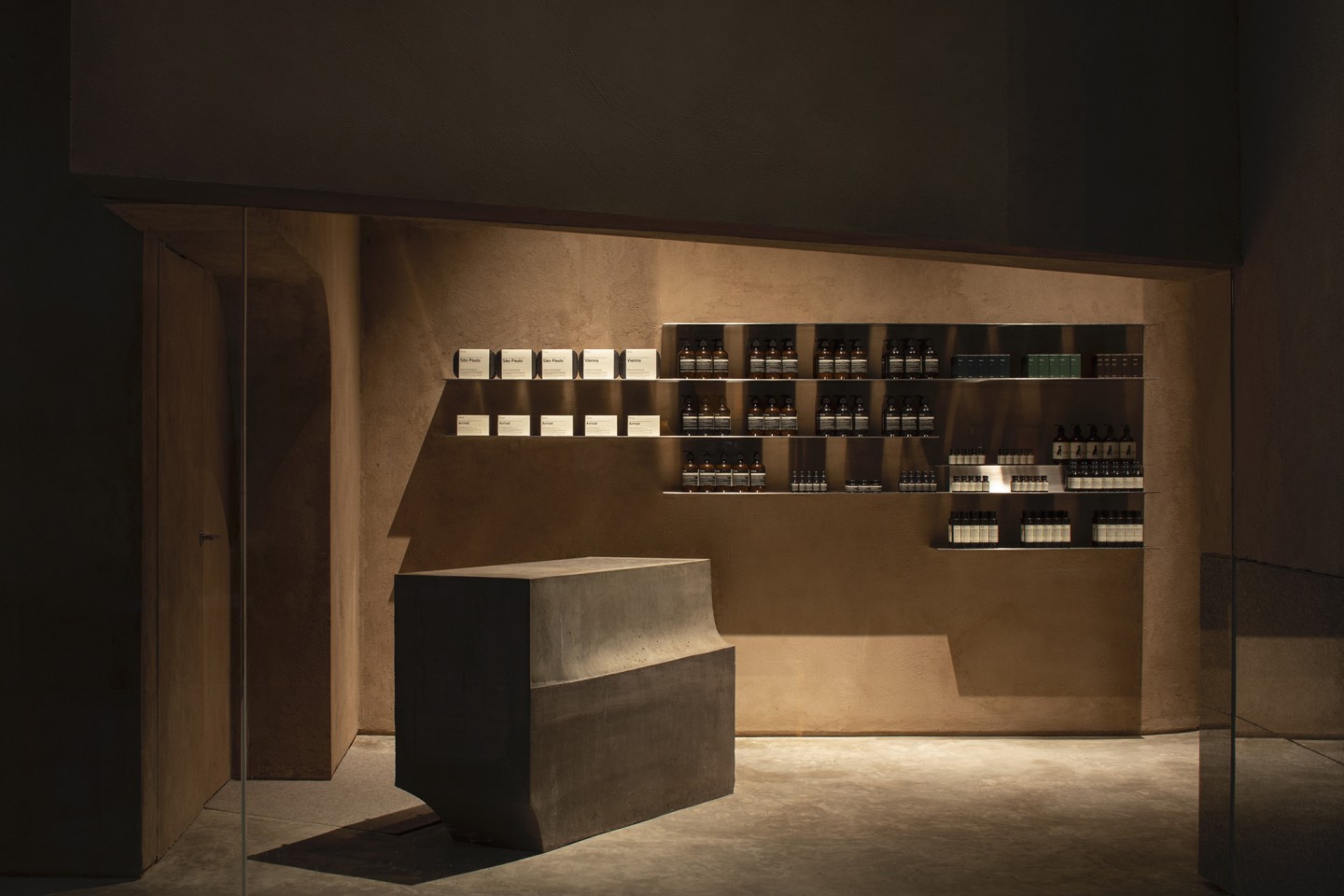
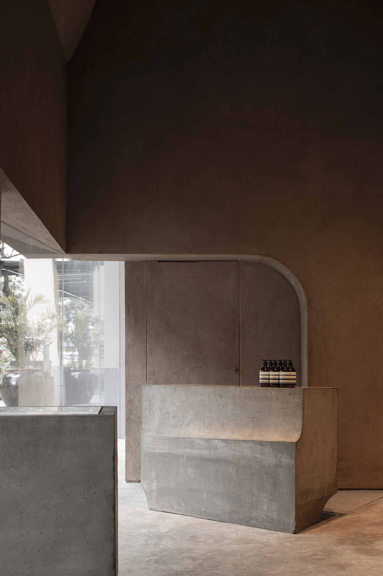
The material palette started with a locally sourced marble. The quarry is quite close to the city, and it has unusual mixed streaks of grey and beige. The dusty grey color is an excellent match with our cast concrete furniture, while the beige tone works with the limestone paint applied on the entire floating mass. The remaining materials — hairline stainless steel shelves, grey carpet, and seating upholstery — are neutral colors that complement the marble and overall palette.
You worked with MLKK Studio to design the space, and they also did your Seoul and Taipei branches. How do you choose your collaborators and partners?
We consider the nature of each project, its size and location, and who would be the best partner for that project. We often approach architects after seeing their work or hearing them lecture. Then, we give a thorough brief and allow the architect to interpret this with original concepts, while providing guidance on the operational details necessary to make each space functional and successful.
With Studio MLKK, we have found our partnership especially synergistic, given the fact that co-founder Kian Yam was one of Aesop’s first in-house designers. This meant MLKK has had an innate understanding of Aesop’s design and brand philosophy from the outset. We knew they would provide an interesting concept and well-planned example for our first store in the Philippines.
Entering the store certainly feels like perusing the halls of a gallery. Can you walk us through the design process and the experience you hope to invoke in visitors?
Our design process is always a response to that particular site and local context — in this case, Locsin’s influence on the area. Our in-store experience focuses on hosting the customer. When entering an Aesop space, you are welcomed as a guest in our home, offered tea, some conversation, and unobtrusive personal service. We aim to provide calm, human environments that nurture the senses, while feeling and smelling as good as they look. Our spaces are also designed to be both visually interesting and comfortable, with seating and reading material provided where space allows. It’s an opportunity to time out, enjoy beautiful products, and excellent service in a space that appeals to all the senses.
How do you ensure the Aesop brand stays consistent across various spaces? What do you think ties everything together?
We aim to create something worthwhile — to add rather than subtract. We look at the area and try to retain and redeem existing façades, working with a relevant vocabulary to communicate our values within the design. It’s not only design, but also a series of seemingly minor decisions that align to make our spaces captivating and comfortable. We try to concentrate on one strong design idea in-store, but there is a lot of attention on the supporting details. In turn, these individual components form an integrated, harmonious whole.
What is consistent is a welcoming and visually calm atmosphere, and the feeling of being hosted in a domestic space with expert personal service. Elements like the sinks and sales counters will look different, but [still] serve the same purpose in each location. The function is not reinvented with every new store design, but [the way it] appeals to all five senses is considered in every location. Fragrance, warm lighting, acoustic comfort and interesting music also play their part in the whole.
Aesop Greenbelt is located at Greenbelt 5, Makati. Kindly observe the health and safety measures set in place. Aesop Philippines is also available online at aesopskincare.ph.

