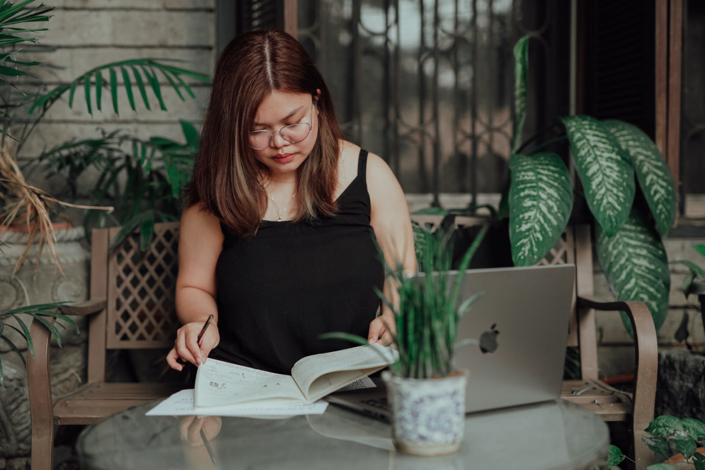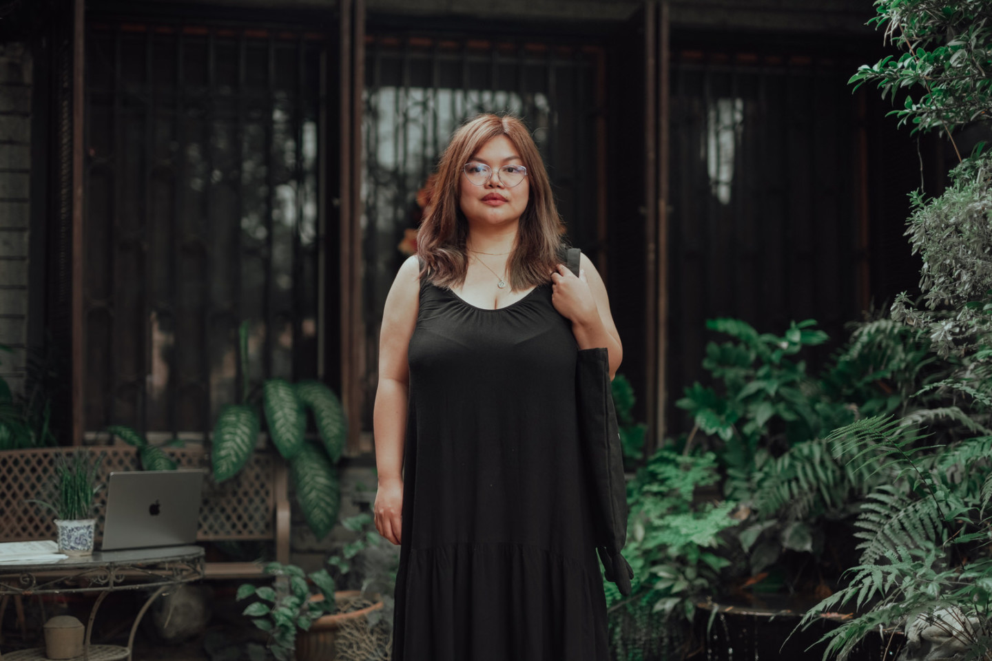
In the world at large, messages aren’t only told but inferred. For Jo Malinis, this inception of messages within plain sight, especially in the arts of design, offer more than the visual niceties expected of an economically viable landscape – both in pop culture and entertainment. As a graphic designer in Quezon city and lecturer that teaches visual communication design and production arts, the tools themselves can be the story. We got some words on what it was like to design typefaces, the differences between body typefaces and display typefaces, among other tips of the trade, as well as her experience working with Plus63 and Hydra Design Group.
What does it mean for you when people talk about “good design?”
Visual communication design is different from graphic design. While it is based in graphics design, it teaches how to combine competency and industry into creating an effective visual design that anyone can use.
What has your recent work with Hook been like?
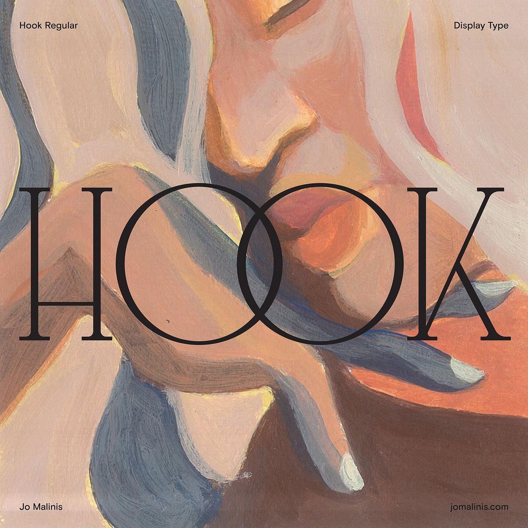
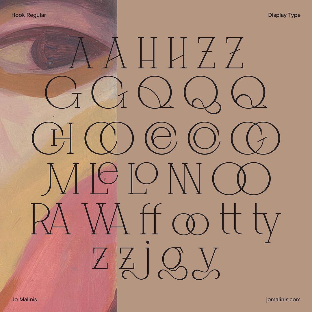
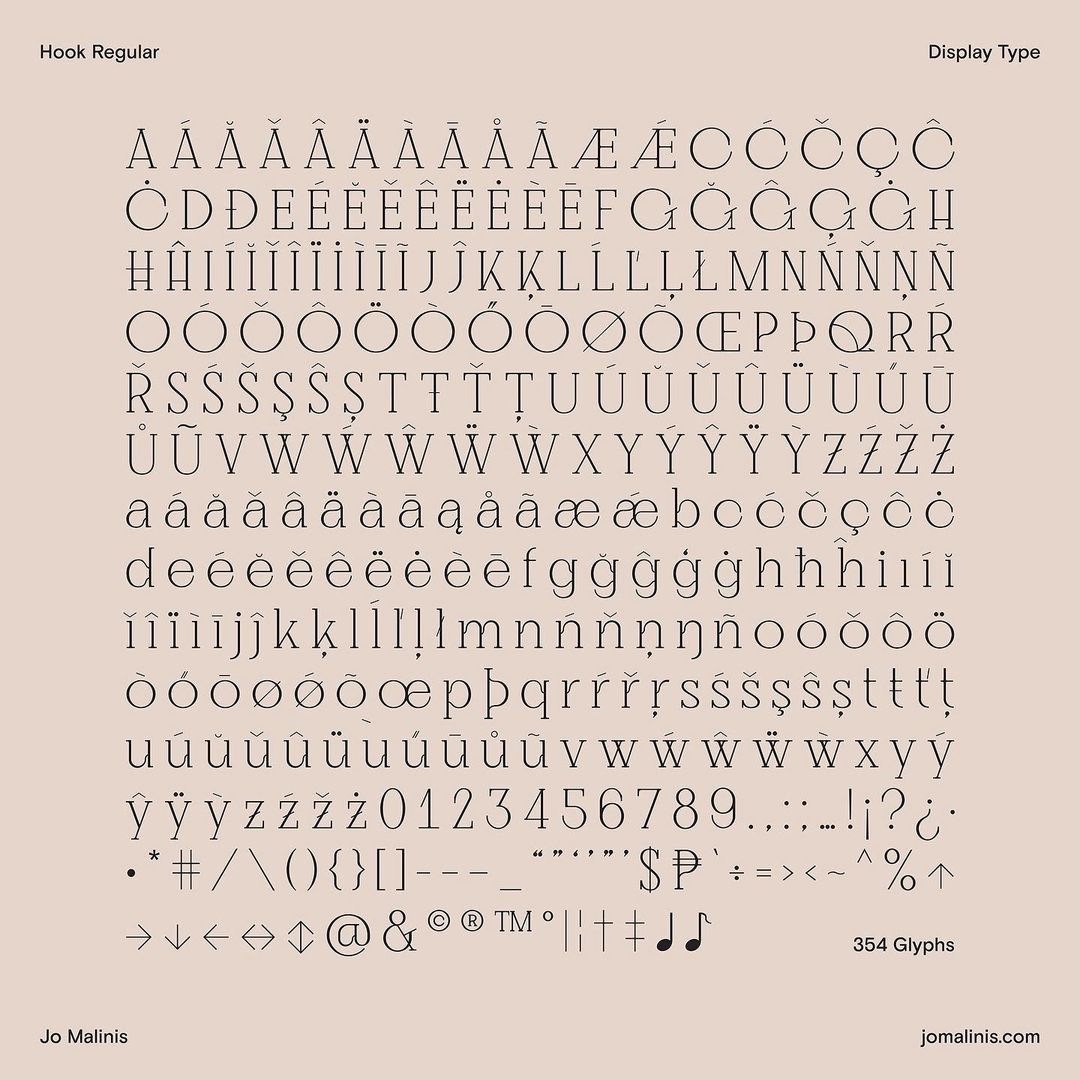
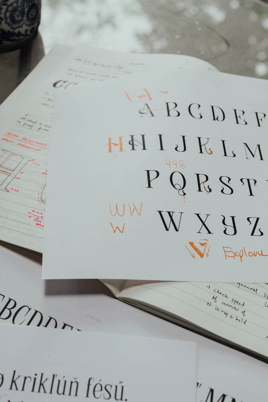
Hook is my baby! I’ve been doing typefaces, custom types, other projects for brands before, but Hook is the first ever typeface that I’ve released commercially. I knew that it was going to be very personal for me – with no one else to check on it, like clients or bosses, and only myself to look after it with other mentor’s critique, I was my own boss. It was very personal and based on music: hooks of songs, from different types, translated visually through the forms of letters, hence, a curl downwards that’s shaped literally like a hook.
Sometimes when I’m sketching and working on other things, I’ll be listening to music and this is where I get the spark. No visual reference; just an idea, conceived, and applied with design principles.
Can you tell us a little bit more about Plus63 and Hydra Design Group?
Plus63 is a design studio that usually does brand and identity work, especially along the lens of visual and graphic design. We do packaging work, design; and while small, with three active members and three bosses who work behind the scene, it’s a studio that’s part of a larger design group — Hydra Design Group. Hydra Design Group has 4 creative studios inside of it, composed of two graphic design studios, one interior design studio, and one post-production studio.
It’s actually a fun environment to be a part of because of the exposure to the productive minds — learning from each other from projects that you work on, especially working with other graphic design studios inside of Hydra. Most of the time, we’re mostly just working on our own projects, sometimes pitching in for the larger set of collab work between all of us.
How would you describe your time in Plus63?
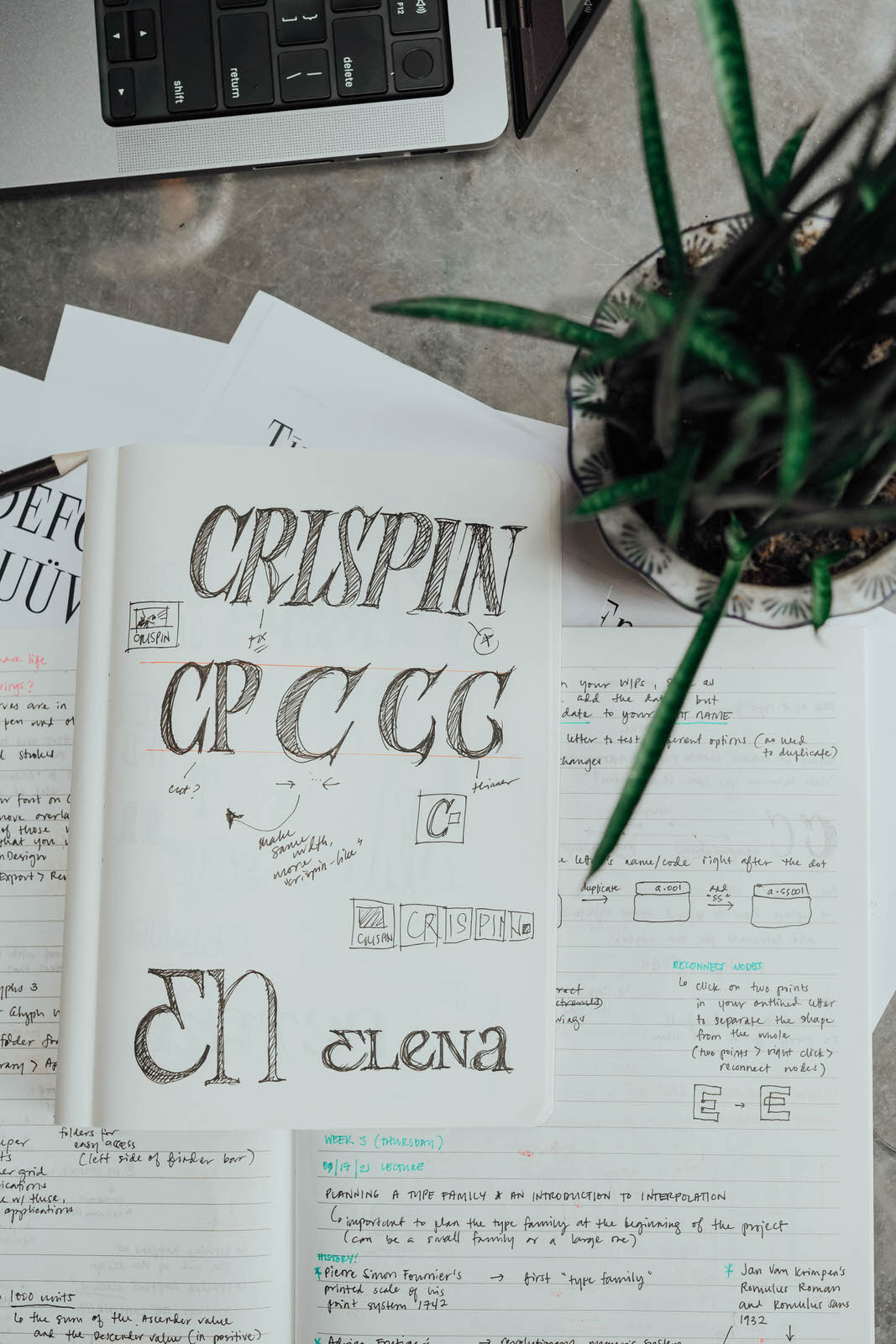
It never crossed my mind before to be a typeface designer. I just never thought it was a thing, that it was a discipline with its own practice. So when I came across the discipline during a project back in 2014 or ’15, I was tasked with making a typeface based on a logo for this project. It all started from there, you know? Asking: “How would I do this? How would one come about with making a typeface?” Snowballed from there, with making research, learning how to start it even without the strict educational background. It helped that graphic designers were already used to working with typefaces and typography, showed me that anyone could do it, really.
From there, I started experimenting, doing it a bit more of it on my own. It was then that others in the studio and in Plus63 encouraged me to try doing more typeface jobs for other brands — UP Fighting Maroons, the typeface for Kapihan named “Kwadra Display.” I’m thankful that others in the team – including my bosses – had pushed me to take more of these typeface projects. I’m doing my post-grad certificate with Type West, a post-graduate and type design program, and I’m definitely learning more and more.
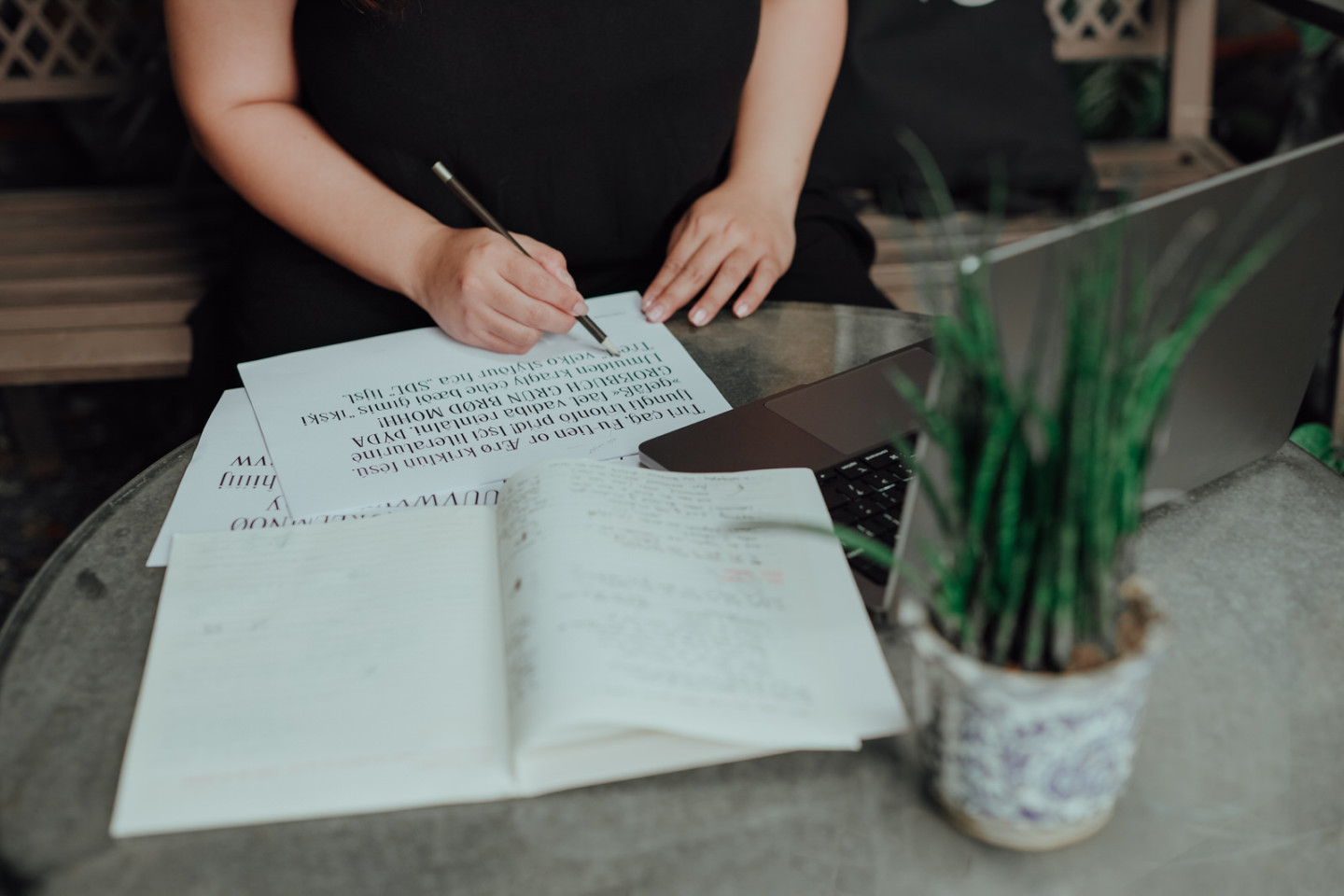
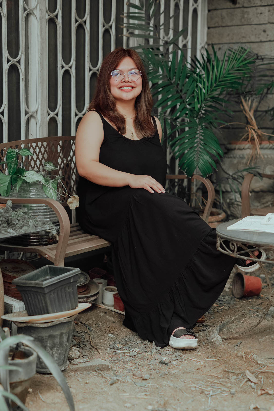
Photographer — Zaldine Alvaro
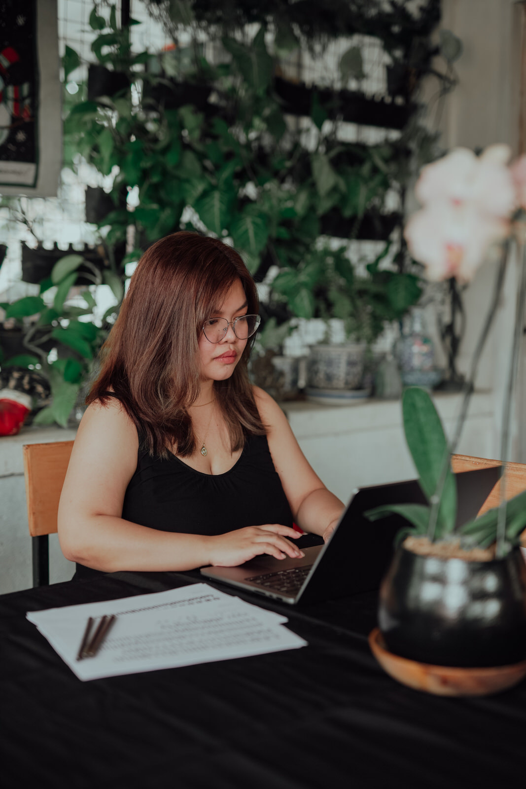
What was your process in crafting Kwadra Display, Kapihan’s typeface?
For most of our projects, it really starts on brand identity, which means focusing first on the logo. We needed to reference how banig patterns were used, how they appealed visually. One of us thought that, since we were already focusing on the logo, ‘why not make a typeface, too?’ That’s where the core inspiration for Kwadra came from — just that idea of weaving, a digital space, how pixels come together as a single, cohesive thing.
What was your experience as an instructor for design, given your background?
I’ve been teaching in UP for almost a year, starting earlier in the pandemic. Before that, I’ve also had experiences in graphic design studio that I worked in, as well as being charge of the internship program that we have. While those things are similar, it was because of our internship program that we didn’t think of our graphic design output in terms of actual projects – rather, using curriculums laid out for them that they follow and learn from.
Take time to teach these students one on one and make them understand what they’re doing — giving them straight forward critiques that aren’t personal, which help them grow as graphic designers. It was part of what made Type63, one personal project of mine, so much more special.
What was handling Type63 like?
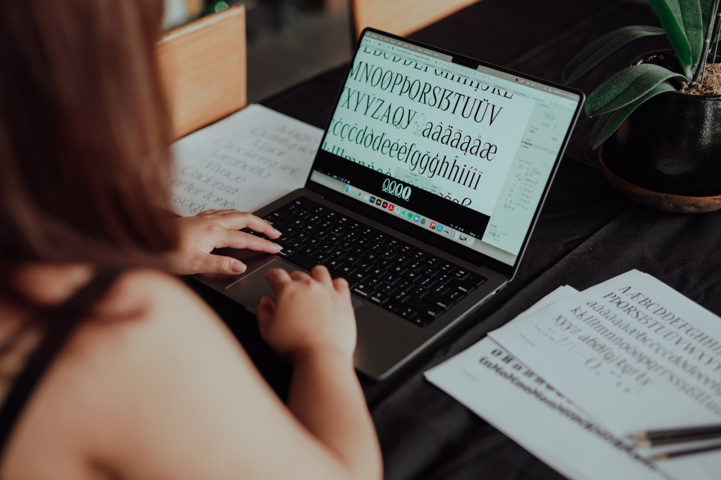
Type63, named for types taking place within the Philippines’ country code, is pretty much started as my solo mission when it came to type design and typefaces. I worked on it with a bunch of people. During my time at Plus63, this project became a way for other people to explore type design — leading to me noticing that more and more type designers becoming more noticed, more visible. Of course, the sound decision became solidifying it as its own space with its own account, where type artists could consolidate their works, come together, offering a larger branch out to get noticed, get discovered, etc.
It helped too that Type63 didn’t demand so much of my time while at Plus63 and it was something that I used to casually connect to different type artists across the Philippines. We’re all so focused on what counts for “good” or “bad” design, but there’s so little push on challenging these notions — what does make it ‘good’ or make it ‘bad’? This is something I think Type63 helps to overcome.
Where do you see contemporary Filipino design in popular media going? How do you feel about retro elements making a resurgence for up and coming designers?
I’ve noticed that a lot of designers are now incorporating Filipino elements in their work and I love seeing it! I think it’s a wonderful part of exploring your culture and identity, working to apply it in your designs. My only wish with it is, in exploring these visual elements, I hope that it isn’t limited to only the surface level in incorporating these elements in your designs: really understanding where these inspirations come from, seeing the sources; see how far you could go with studying and recreating these legitimately and sincerely.
Was there a specific point that gained your interest in the design industry?
In my typography class, there was one studio project that helped me get started. After that, it was when I discovered Klim Type Foundry, based in New Zealand, that helped introduce the idea of fonts telling stories. On their website, you’ll see how they explain the origins of their typefaces, some inspirations among other things.
It made me understand that these things have deeper meanings. It was admirable.
I grew up with parents who were both in creative fields – mom was in publishing and dad in graphics, which really helped to have role models growing up. Needless to say, a lot of creativity going around.
But type design! That was something else. There was no ‘design hero’ for type design, no ‘set standard’ as to what ‘good’ design looked like versus ‘bad’ design. Maybe it was because of the prevailing post-colonial biases of visual identity that the West brought, the hegemony of always looking there for design reference, but it did take its toll — not just on me, but on the industry as a whole.
You could still see it within the vein of arts as profession — where we take from the inspiration of arts and appreciations from generations before us. I guess that’s what I’m trying to explore as a type designer, as well.
How important is typeface to the visual identity of a brand? What lessons are hidden that the title card can already teach?
I feel like typefaces and logos are more like introductions to brand, if you have a solid product, you can’t really clock it. If your logo or visual identity is ineffective, before I could even know the product, I wouldn’t even bother if it wasn’t something I was attracted or related to. It’s still important, but you still need to have a solid product.
This does remind me more of the ‘blanding’ craze we had a while back. Blanding is purposely devoid of striking and contrasting details—making elements as flat as possible. It made the products speak for themselves!
For me, though, I’m not into it, and I try not to impose, especially with brands that I work with. It can be a bit of a trap to fall with trends that are present, be it minimalism or whatever.
Typeface design is much more sought out now than it’s ever been, with more typography and type enthusiasts sprouting left and right — why do you think this is?
Exposure to the Internet, more than anything else. You see how trends move, how people embrace different art movements, and design movements. It could also be that visibility online has made it more accessible. So maybe people liked it, people were already exploring it, but media exposure has only just shown us more of what we’ve already had.
As for the state of local type design, It’s still emerging, I think — that we’re still in that phase of discovery where even if there were few design foundries, more designers here in the Philippines, they’re still regarded of being not that well known. So, it’s in infancy, to put it in a sense. There’s quite some ways to go. One of the goals of Type63 really was to offer a larger spotlight as to who these people are, understand where they come from and what they do. And so we’re still at that stage, you know: getting to know them better, get a better feel for their work.
The change is noticeable, though, even when I was just starting out. I’m noticing that it’s a lot easier, more accessible, for other designers to get ahead with references and websites for ideas. A huge bulk of type design and graphic design relies on branding work, so that means knowing how to get the look that gets people to really notice, you know? Back when there was no Pinterest, a clunkier Instagram — seeing all these designers have so many more sources for their ideas, it’s really something else. Design is everywhere; so much easier to consume.
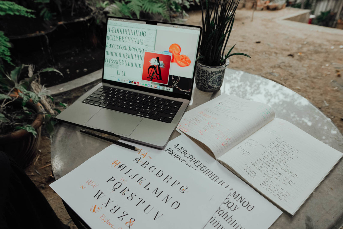
In the most defined and concrete example, what is the most important thing about type design?
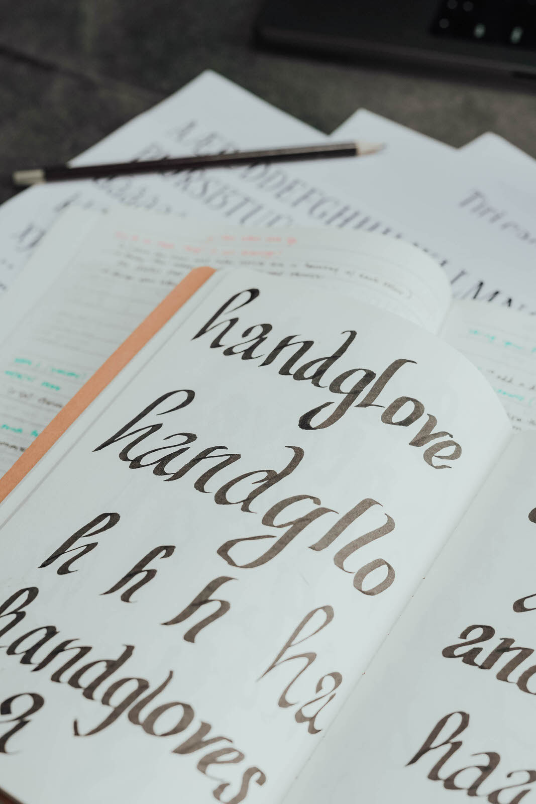
It’s one of the main building blocks of design, especially when you use it to communicate. You deal with words — meaning that typefaces, which are representations of said words, letters, meaning they become the stand-ins for the tone you want to convey. Mood, tone, and even the way that it’s written; typefaces help to push these further. One analogy I like is that of clothes: “Typefaces are like the clothes that letters wear.” The look informs mood, which informs emotions, which conveys meaning. Aside from type analysis being a way to mark eras of time, the Roman empire’s typography as an example, it helps transcend the words it wraps around. This is something Philippine designers can take heed of, as well. What story is your type telling?
In the face of stagnancy or repetition, how do you remain a stern step in innovation?
Not trying. Haha!
Trying means pressure means frustrations means I don’t like the work I make. But when I take rests, have small breaks, that’s when things come out for the better. Whether this comes from age or something, but I’ve just really come to appreciate the value of resting. I’ve gone through so many projects over the years to know that rest helps with innovation.
For me, it’s more random; whatever comes to my mind is what I work on. When it feels stagnating, I try to take a break and wait for inspiration to hit me again and move whatever I was working on. While I’ve only released two typefaces, and both look quite different from each other, maybe these kinds of patterns emerge and become more evident over time. What fits, fits. What doesn’t, can take some more time in the works.
If you were to choose between handling typography and design clients for the rest of your career, would you choose: Hotel/Restos, Film/Media/Music, or Corporations?
Restaurants, honestly, because I love food — not to sound shallow. Here in the Philippines, despite the budget constraints, restaurants have so many opportunities. When I say I love food, I don’t mean just eating — though I do. It’s the shows, the documentaries, even articles of restaurants and chefs!
Films probably take the spot between being both hard and fun. You’d have to understand what the film is all about, trying to find a typeface to match it. Not everyone is going to appreciate that effort — especially for type designers. But when you take the time, you let its setting and themes set in, it’s a lot of fun.
If you were to tell the public what lesson best surmises your experience with design and typography, what would that be?
Picking the right typeface is a bit like picking the right voice to go with whatever you’re trying to say. When more people understand that type is able to do this or that, I feel like most design materials would be more effective and be able to more properly communicate what they want to say.
Type design is never going to claim to save the world, or anything like that. Though it is a good way to be able to lend a voice to something with sight and not speech.
SUPPORT PURVEYR
If you like this story and would love to read more like it, we hope you can support us for as low as ₱50. This will help us continue what we do and feature more Filipinos who create. You can subscribe to the fund or send us a tip.

