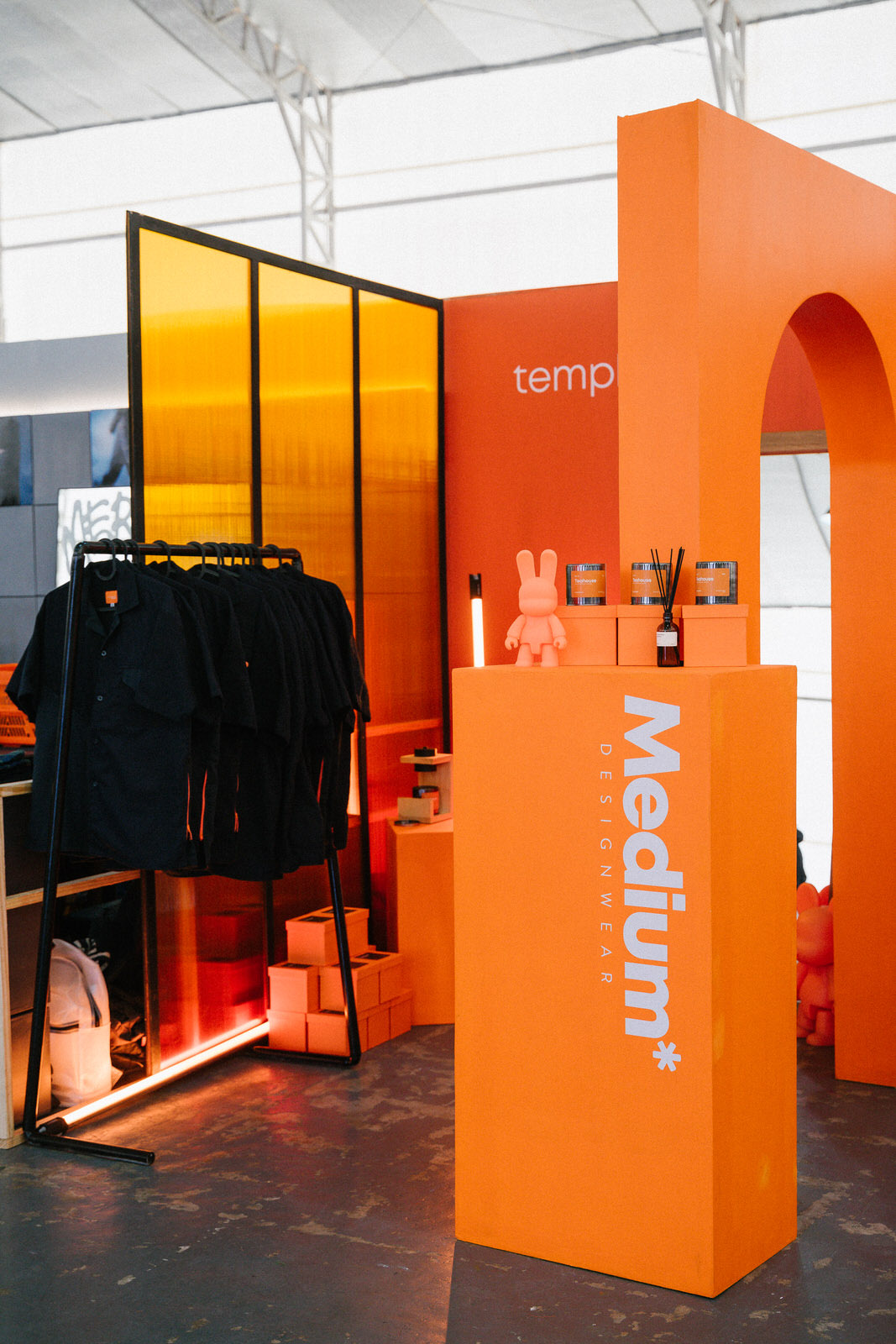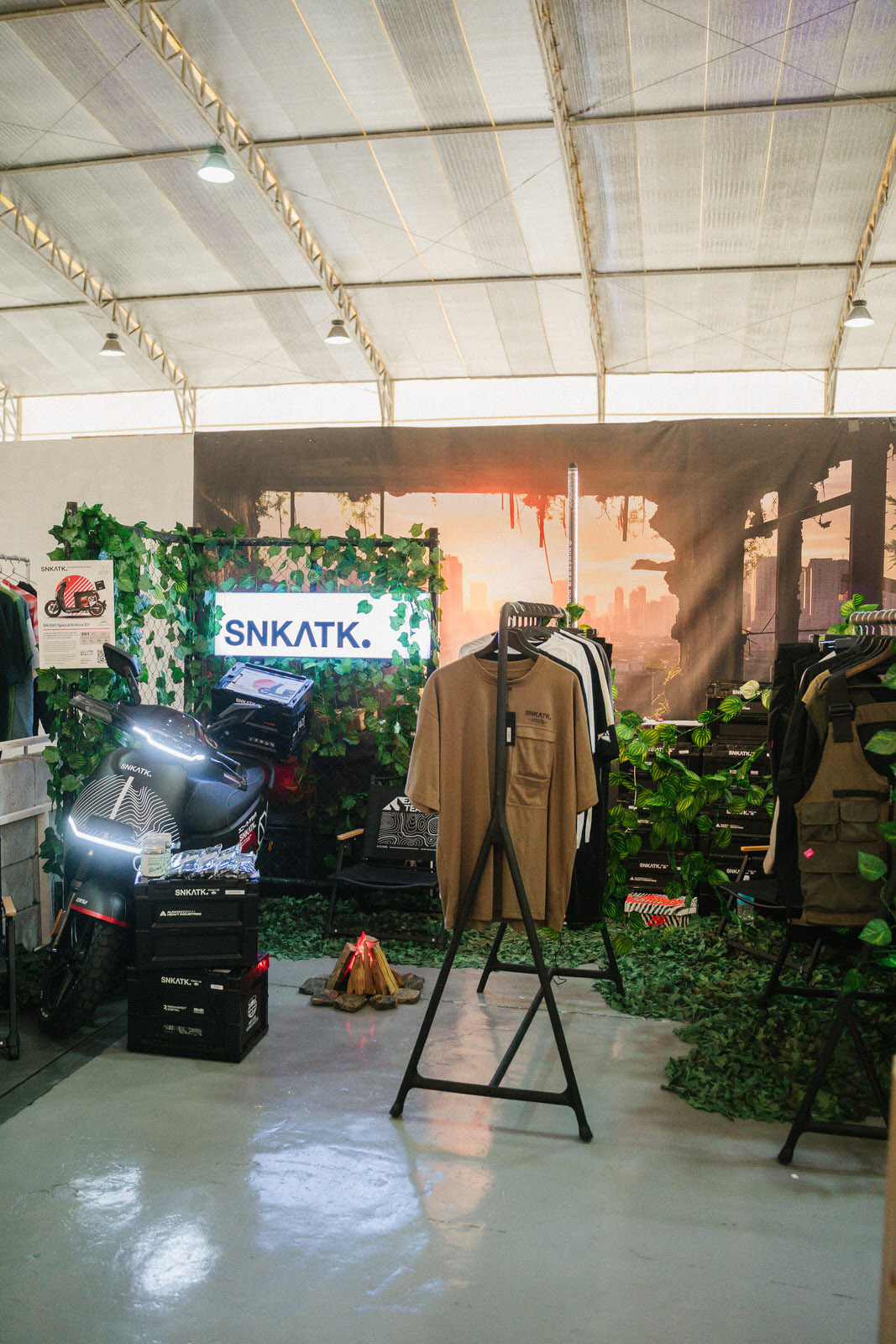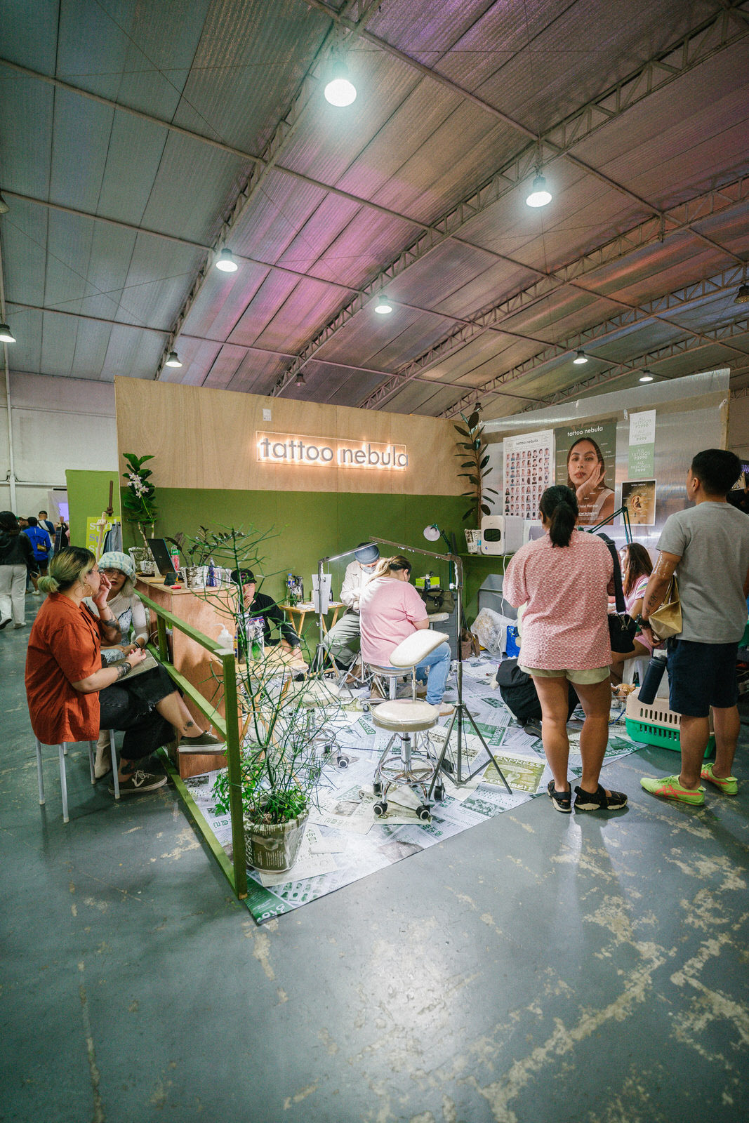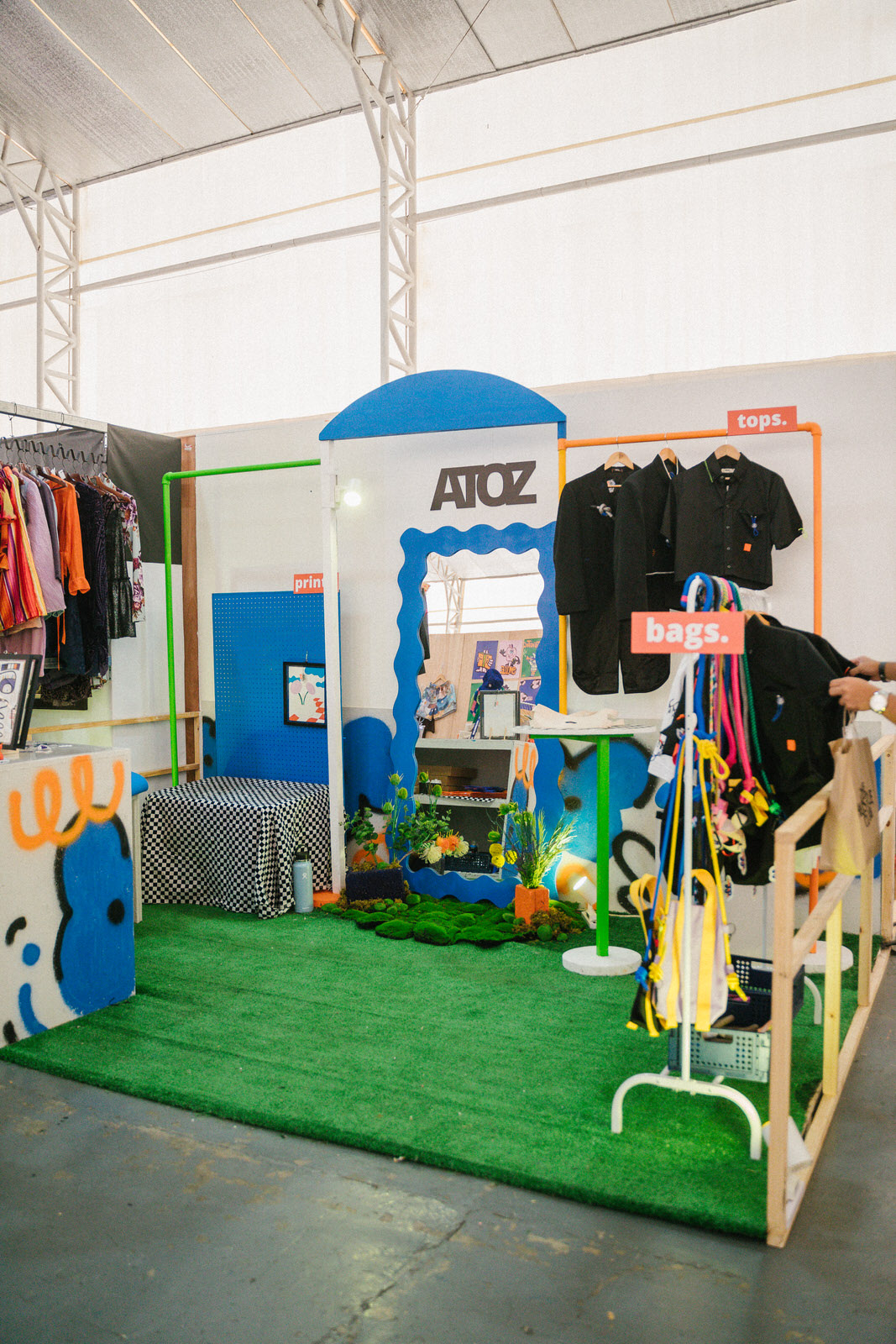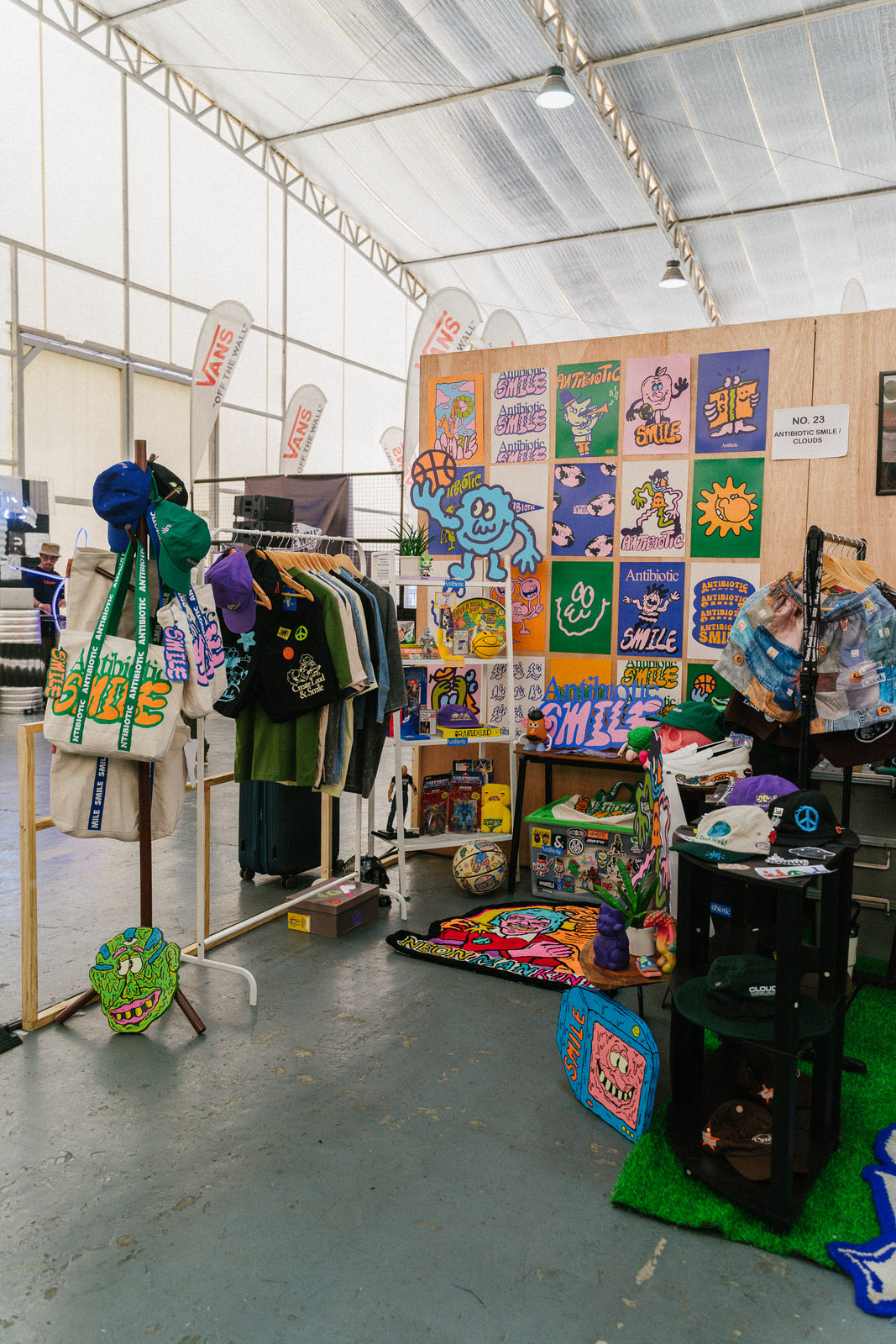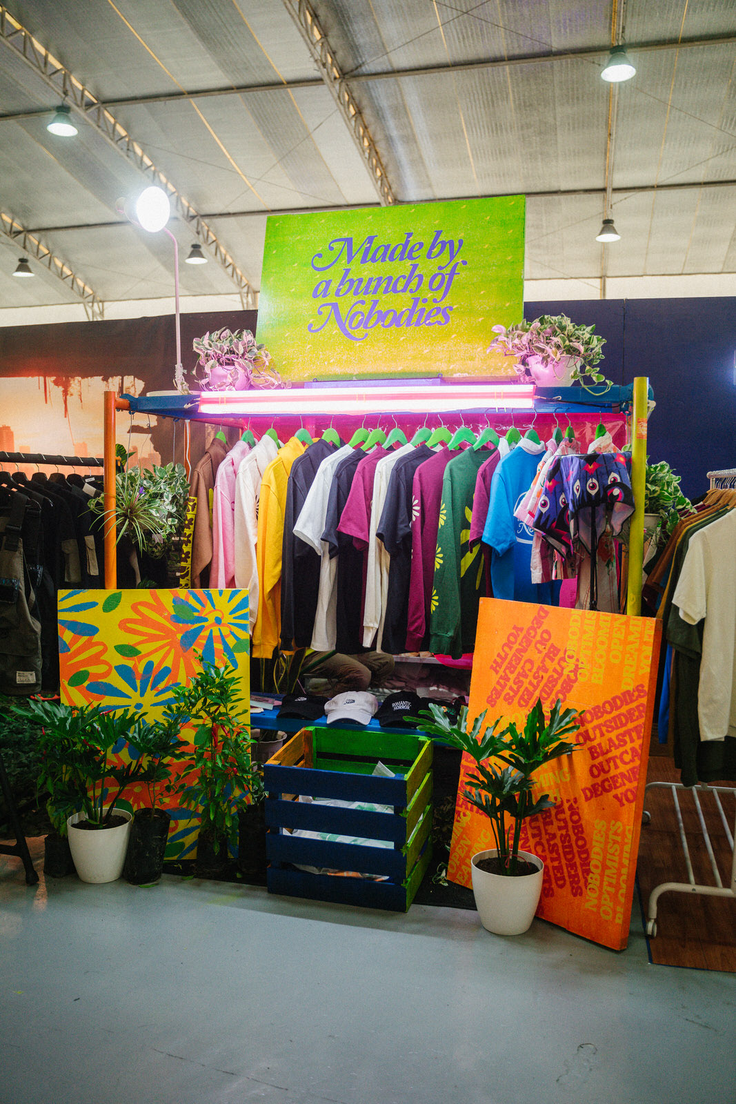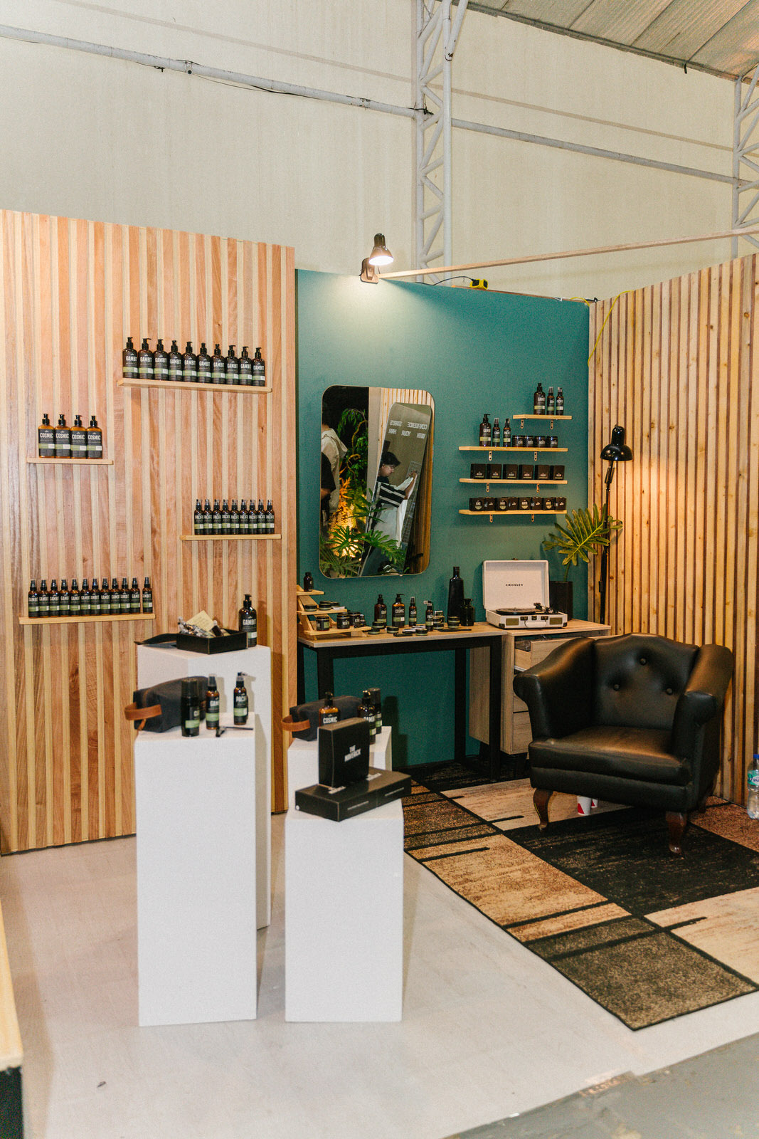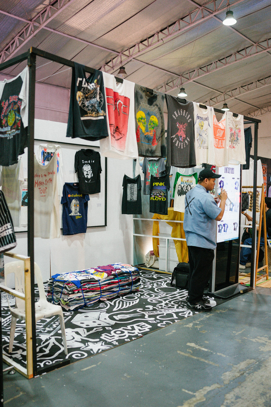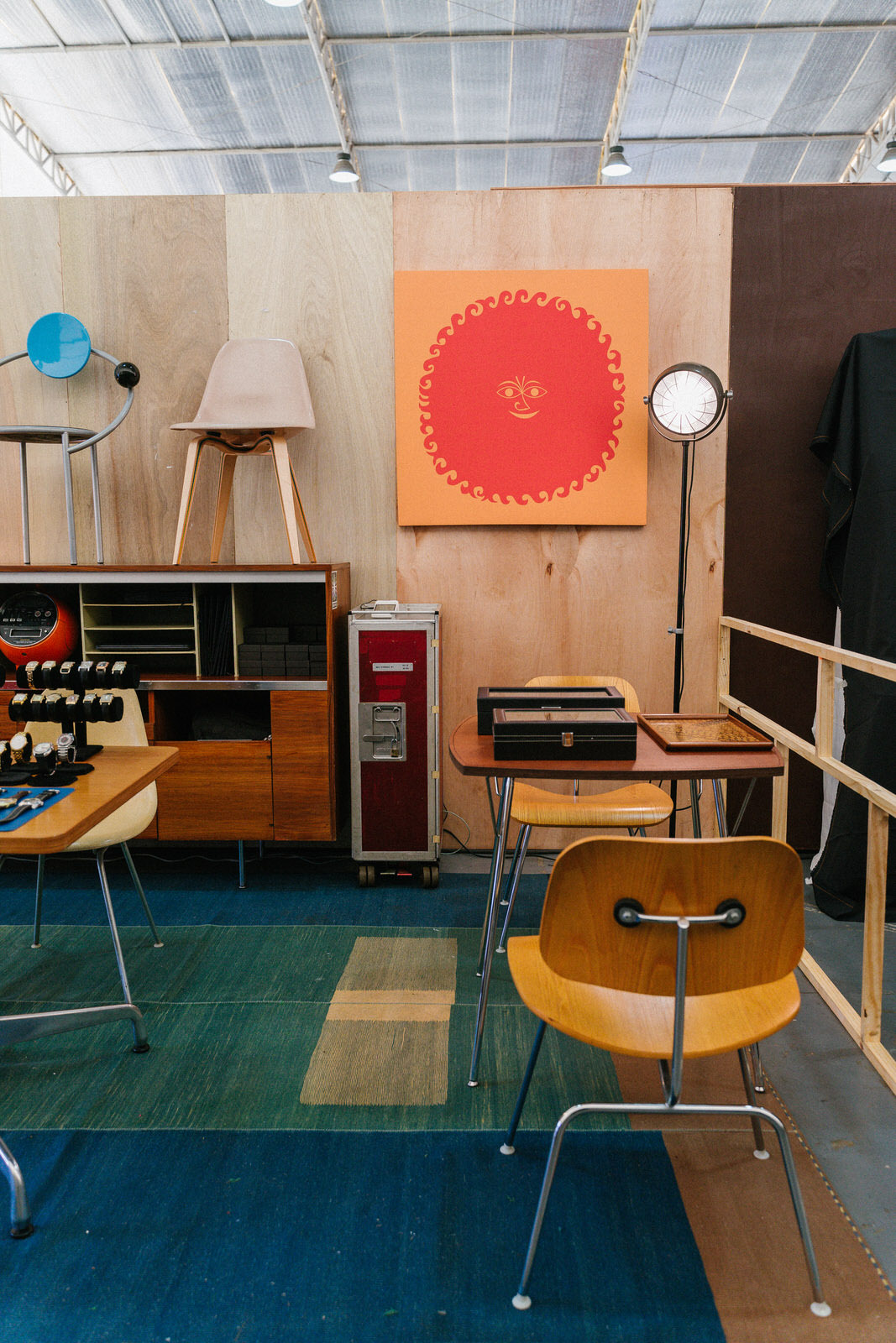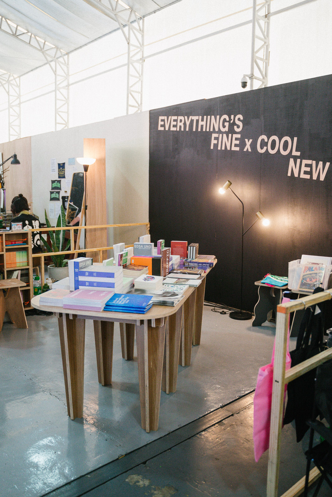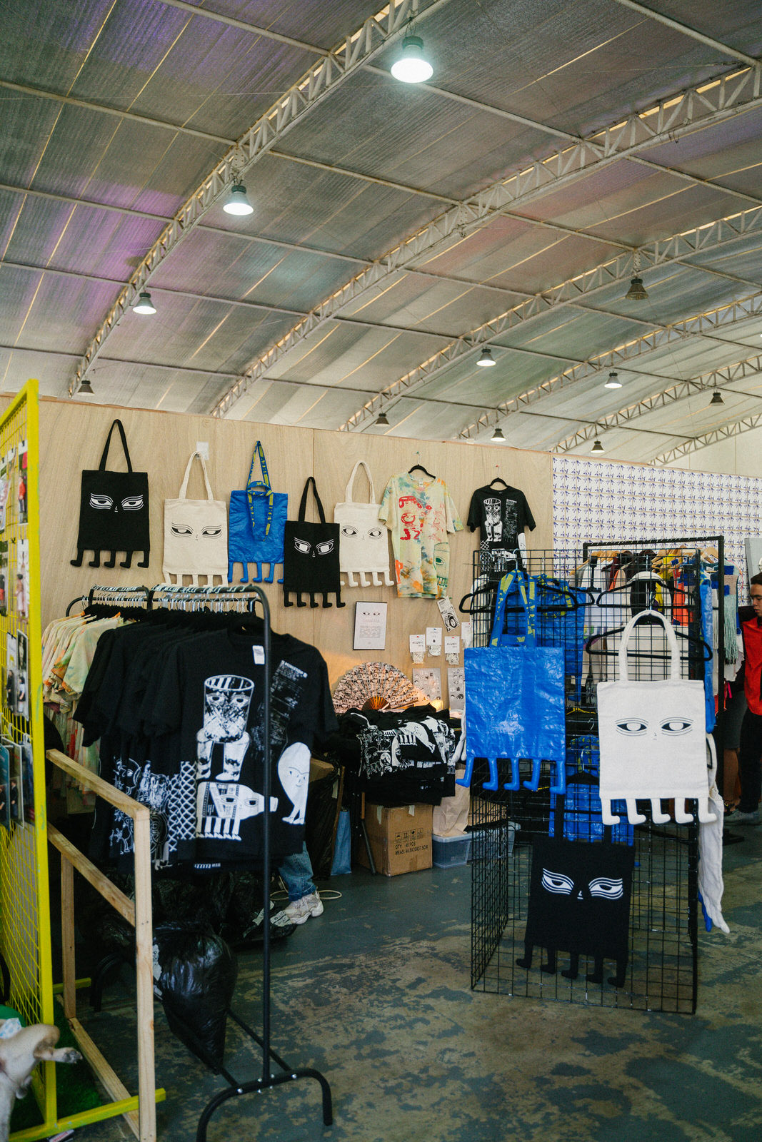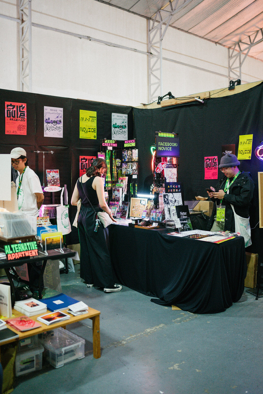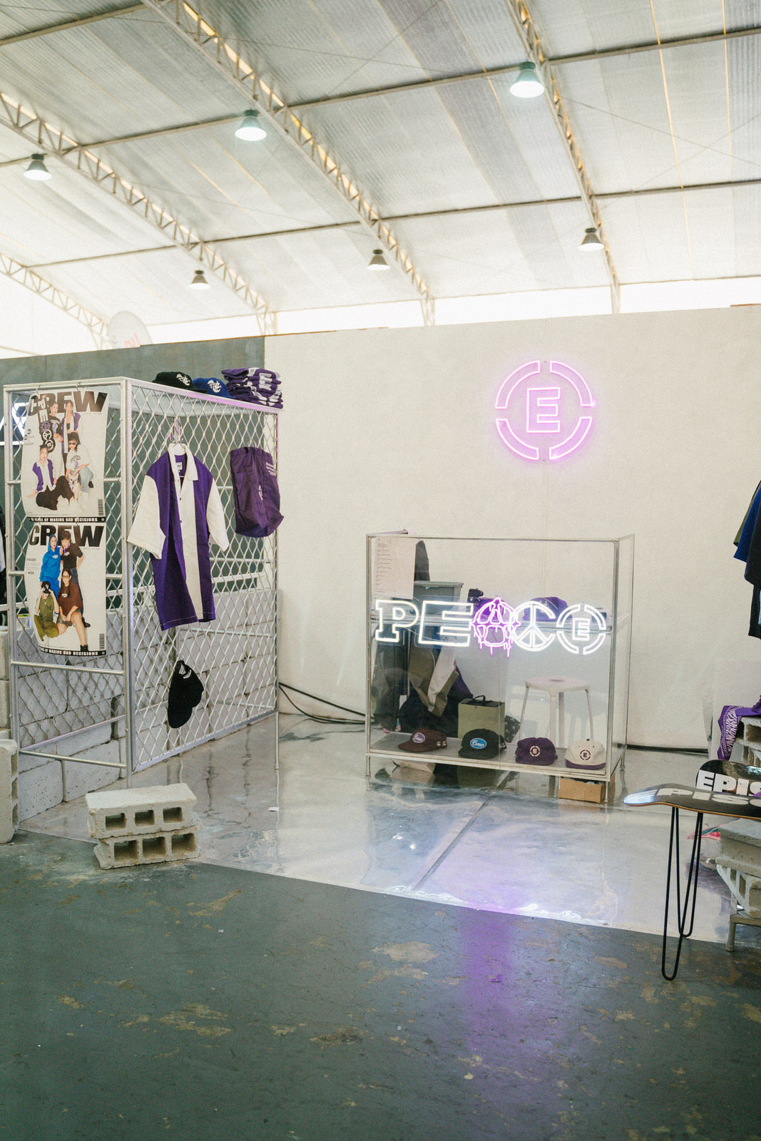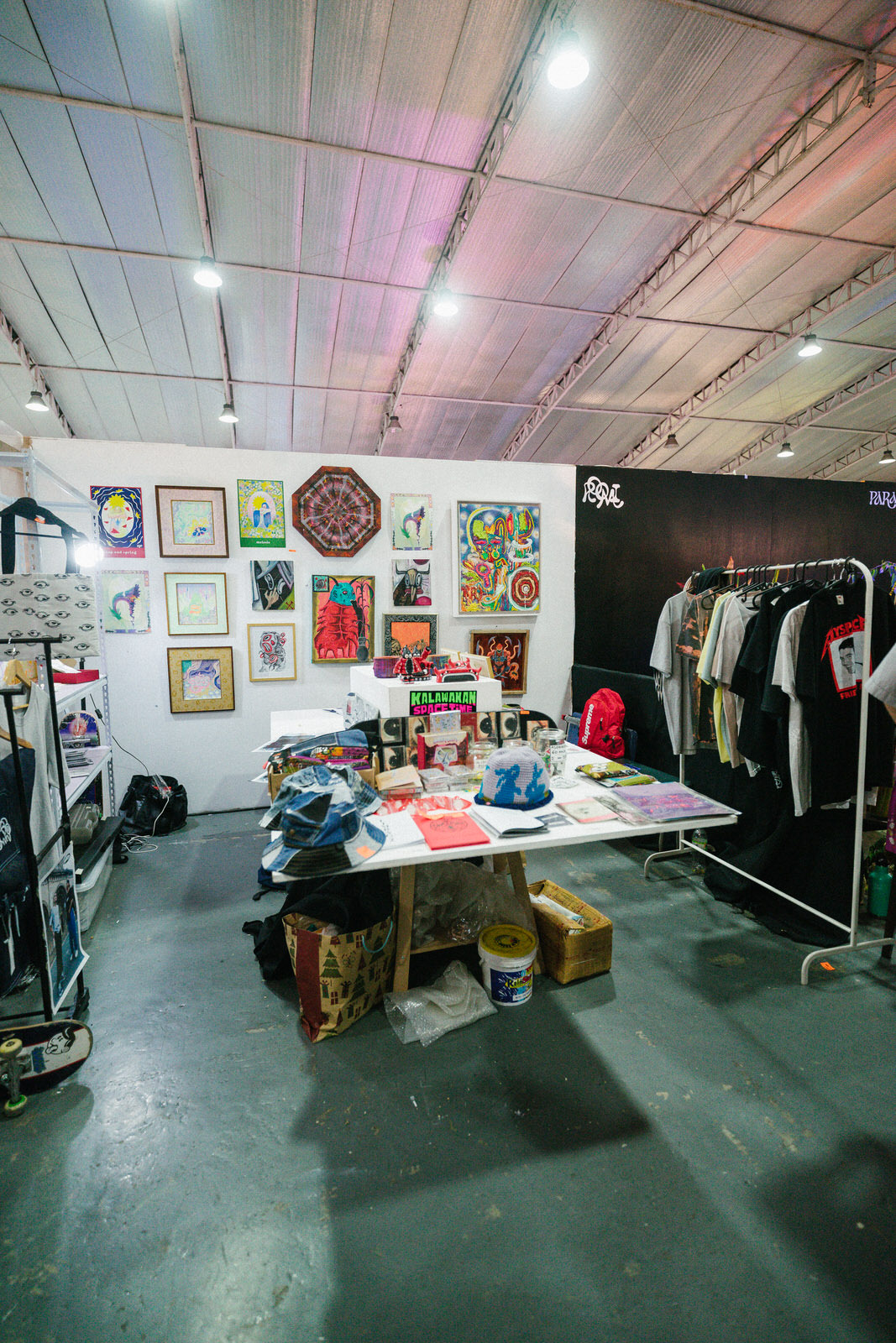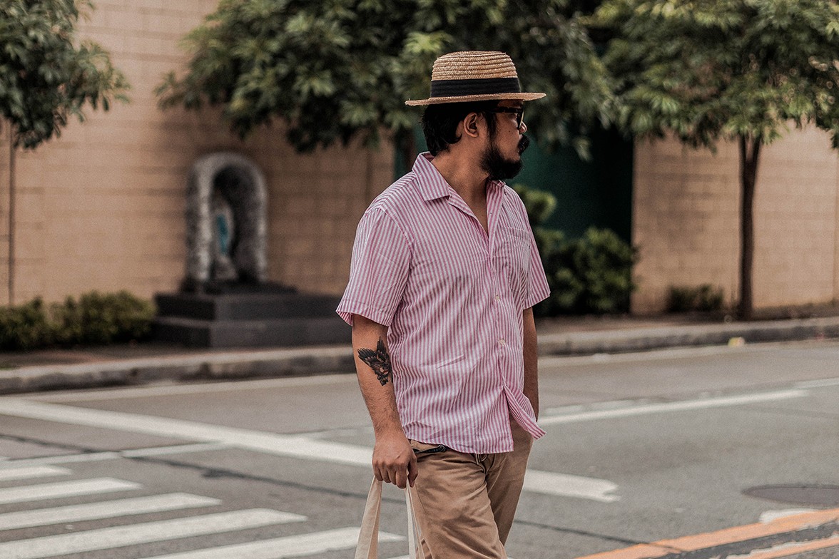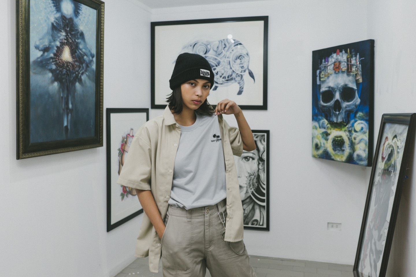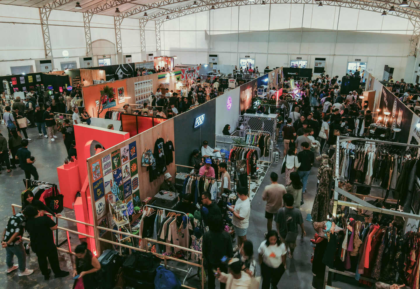
This year’s PURVEYR Fair was my first, and it certainly was quite an experience. Where else can you find floral-mushroom installations, six-figure sum watches, and experimental couture in a single space? Throw in a full-sized skateboard ramp setup and live DJ sets for good measure! The irascible weather did nothing to dampen the creative energy that emanated from Metrotent Convention Center, and I was glad to be around to soak it all in.
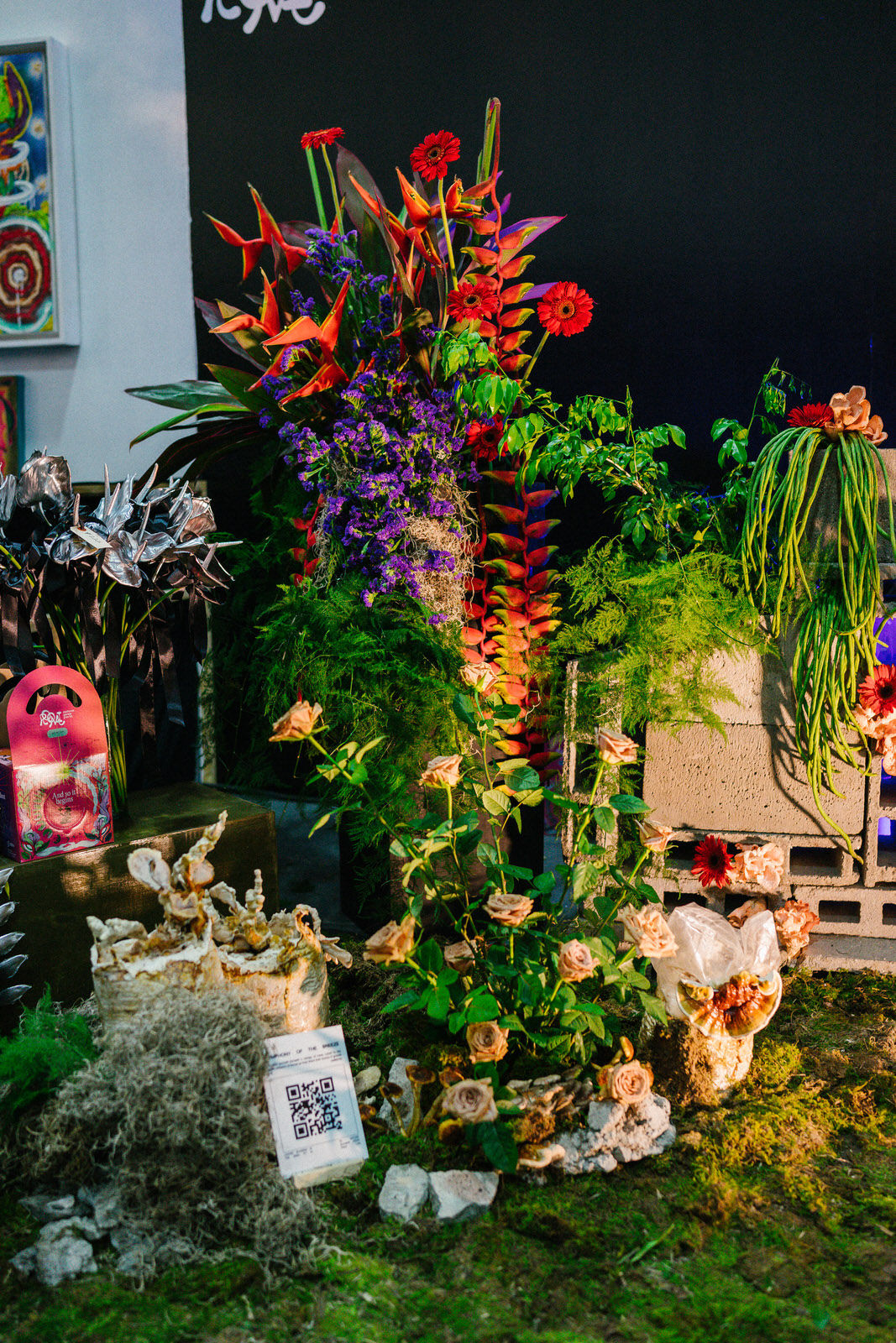
Now, I was at the fair for an important assignment: to help ascertain this year’s best booth design concept, alongside five peers from the creative industry. It was a herculean task in all respects as there were 50 booths to visit (the largest turnout thus far for PURVEYR Fair) and as previously mentioned, the retail mix was wide-ranging: streetwear, experimental couture sit alongside art and design retailers, booksellers, and tattoo pop-ups. There was also the fair’s eventual winner of the ‘best booth concept’ in partnership with Globe Business: Paraluman and Roomi’s mesmerizing floral-shroom display that had passersby posing and whipping their phones out for a snap. How does one then ascertain the best cuts out of this smorgasbord when everyone’s come out with their Sunday best?
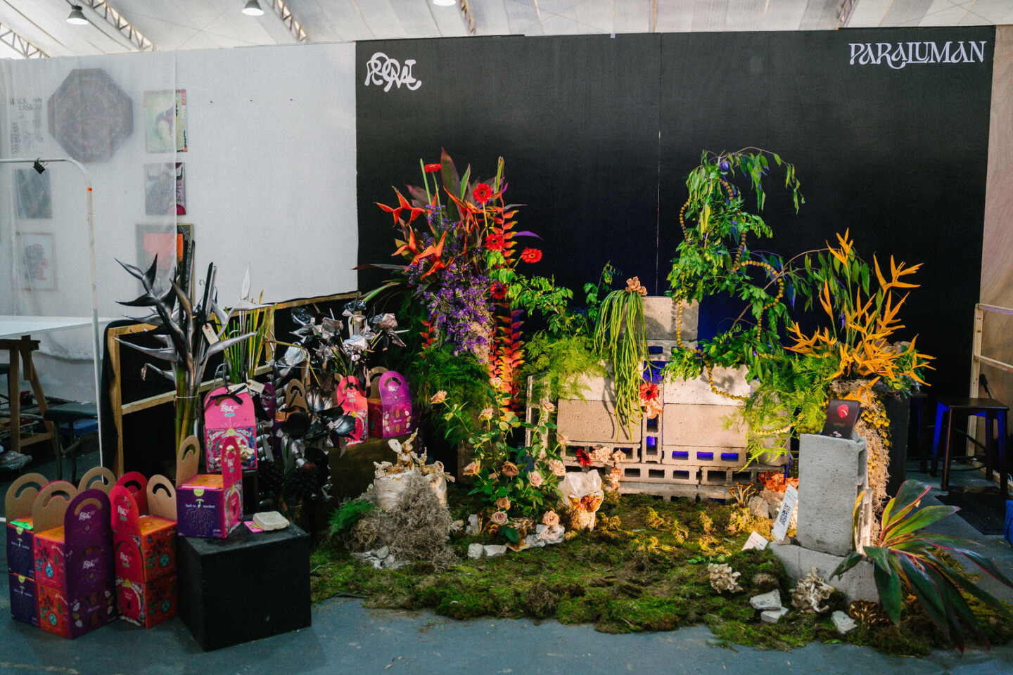
The winning booth design of Paraluman Flora and Roomi Mushrooms
Thankfully, I had a decade worth of visiting spaces and places as an architecture journalist and production designer to draw from, and I’d like to think that it has sharpened my eye and taste on what to look out for. Aesthetics may be a matter of taste but designing spaces, from tiny booths to large shopping malls, all rely on the human experience at the end of the day. No matter how many gimmicks and programming you can cram in a space, if it does not resonate with or respect the audience, you lose them. It was vital then that I also observed how people interacted with the booths; not just to watch sales being made, but also to see how the tenants interacted with visitors, or how the design of the booths influenced consumer behavior. This is why respected brands like Apple and Aesop invest considerable sums for their physical stores and brand experiences; they seek to go beyond one-time transactional relationships into long-term ones with their customers.
With these observations in mind, here are four crucial elements I looked out for, which are hallmarks of effective retail space design regardless of scale.
Visual Impact
In the cutthroat world of retail, first impressions count. You have but a few seconds to catch the eye of would-be visitors. A retail booth that seizes the attention of passersby does more than draw them closer; it tickles their curiosity and stokes an insatiable desire to know more. Visual impact weaves together a tapestry of elements, from striking signage designs, attractive color schemes and finishes, to imaginative lighting and artful product displays. It’s about creating that magnetic pull that sets your booth apart in a bustling marketplace.
However, it isn’t just about catching a potential customer’s eye. Your store’s visual impact must reflect your brand’s personality and ethos; the booth design and display should be the physical manifestation of the values and qualities that you want your brand to be associated with.
Narrative
A retail booth is more than just a collection of Instagrammable objects and elements; it’s a story waiting to be told. The concept behind a booth should go beyond mere decoration and encapsulate the narrative, theme, or message that the vendor wishes to convey. A compelling concept has the power to stir emotions, ignite curiosity, and forge a deep connection between shoppers and the products on offer, contributing to longer brand recall. This can be in the form of interactive brand displays, choreographed entry sequences that help unpack brand identity or even a script that vendors adhere to when welcoming or communicating with customers.
A well-executed concept and retail narrative adds layers of meaning to the shopping experience, making it not just transactional but deeply personal and memorable.
Functionality
Naturally, aesthetics alone won’t suffice; a retail booth must be as functional as it is beautiful. Aesthetics should not get in the way of a seamless shopping experience. This includes practical considerations such as providing ample space for customers to browse comfortably, easy access to products, and clear, concise pricing and product information.
A well-designed retail booth is akin to a well-choreographed dance–everything flows smoothly by design. The layout is designed to invite customers in, encouraging them to explore without feeling overwhelmed. Beyond aesthetics, functionality extends to the logistics of running the booth efficiently, with ample storage for inventory and a comfortable workspace for the vendor.
Engagement
In today’s dynamic retail landscape, engagement is the heartbeat of success. Retail booths that actively engage with customers and peers tend to outshine even their better-looking neighbors. Social engagement involves meaningful interactions–answering questions, offering demonstrations, and creating an inviting atmosphere. It also pays to know your context when designing your booth, not just to stand out, but to also participate and communicate with the community. Your space does not exist in a vacuum after all.
When vendors engage with visitors, they’re not just making sales; they’re building relationships. These interactions can lead to invaluable feedback, foster customer loyalty, and ultimately drive sales. In the age of social media, positive interactions at a retail booth can translate into word-of-mouth recommendations and online attention, extending the reach of the vendor’s brand. What you desire is something that goes beyond a single IG story or post, but a brand experience that will enrapture buyers enough to try out more of what you have on offer.
Dealing with the intricacies of creating physical spaces and a customer experience to remember, it is always handy to remember our penchant as humans for memorable stories. As a vendor, ask yourself: What stories do you want to tell? Who do you want to tell it to? How will you tell it? What can listeners get from listening to it?
At the end of the day, business owners should embrace the hat of being a storyteller; their booths and products are the stories waiting to be unpacked. Don’t we all love and remember a good story?
For last year’s “Best Booth Design” program for PURVEYR Fair, we approached writer, designer and publisher, Patrick Kasingsing, to explore the idea of what makes an appealing and effective retail space design. Kasingsing is most notably known for founding Kanto and Brutalist Pilipinas. He acquired his knowledge and learned experience in architecture and spatial design in the several years working with BluPrint alongside other architectural projects and gigs.
CREDITS
WRITER Patrick Kasingsing
EDITOR Tricia Quintero
PHOTOGRAPHER Josh San Mateo
SUPPORT PURVEYR
If you like this story and would love to read more like it, we hope you can support us for as low as ₱100. This will help us continue what we do and feature more stories of creative Filipinos. You can subscribe to the fund or send us a tip.

